Halden
A calm, dark SaaS template with a scroll-driven product tour
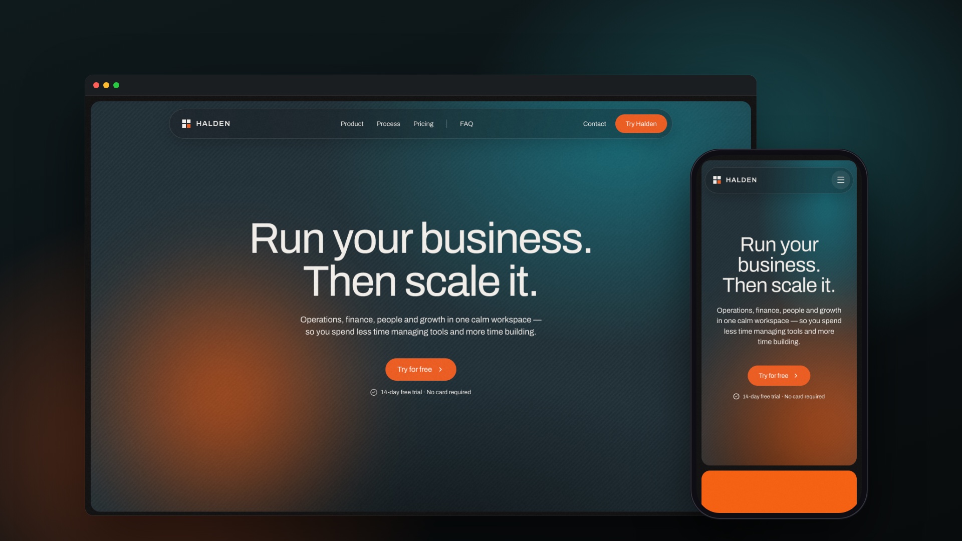
Halden is a Framer template I designed and built for SaaS and business software: a calm, dark landing page with a pinned product tour, a preloader, and native sign-up and contact forms. Six pages, and every one of them editable on the Framer canvas without touching code.
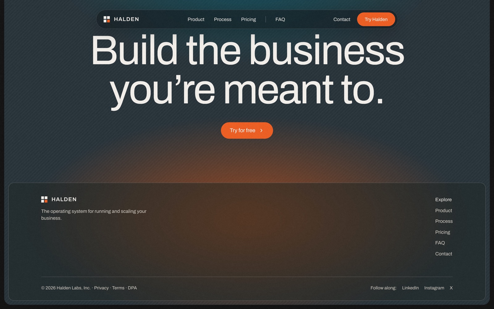
Most SaaS templates compete on volume - bright gradients, busy grids, a row of badges above the fold. Halden goes the other way: dark teal with an ember glow, one typeface in Archivo, a quiet type scale, generous spacing and a little grain, so the product mockups are the loudest thing on the page.
The headline makes one claim in six words - Run your business. Then scale it. - and each section after it backs that claim up in turn.
- Six pages: home, sign-up, contact, privacy, terms and a 404
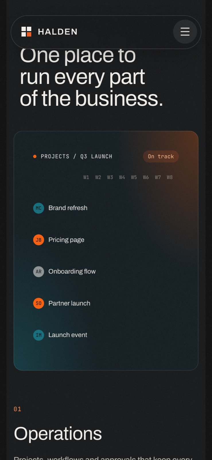
- A pinned product tour across Operations, Finance, People and Growth, with animated mockups
- A preloader with a logo build, rolling counter and progress bar
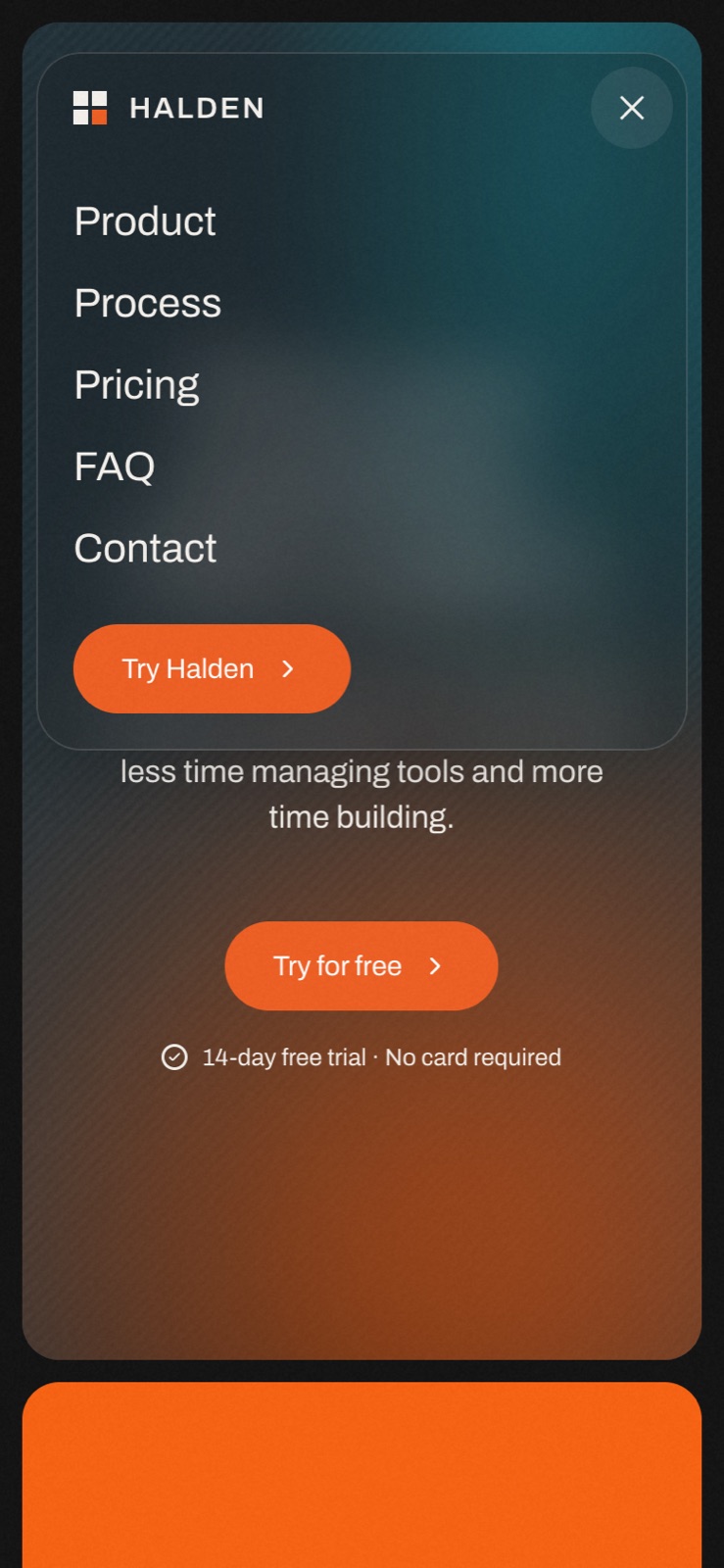
- A nav that compacts on scroll down, returns on scroll up, and becomes a drawer on phones
- Native forms with chip choices and pending, success and error states
- One type scale and one colour system, with CMS collections for testimonials, plans and FAQs
A tour that holds still while you read it
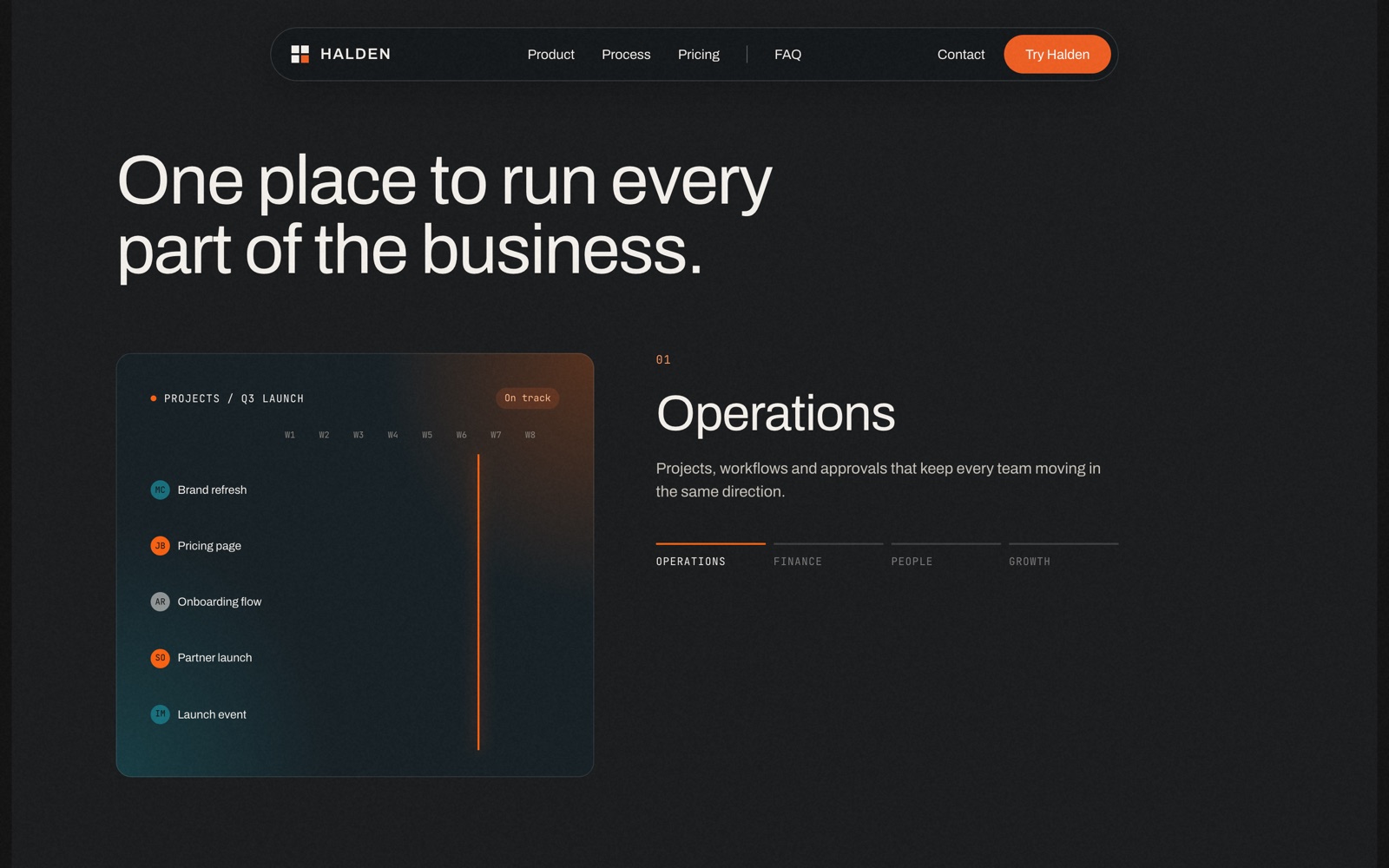
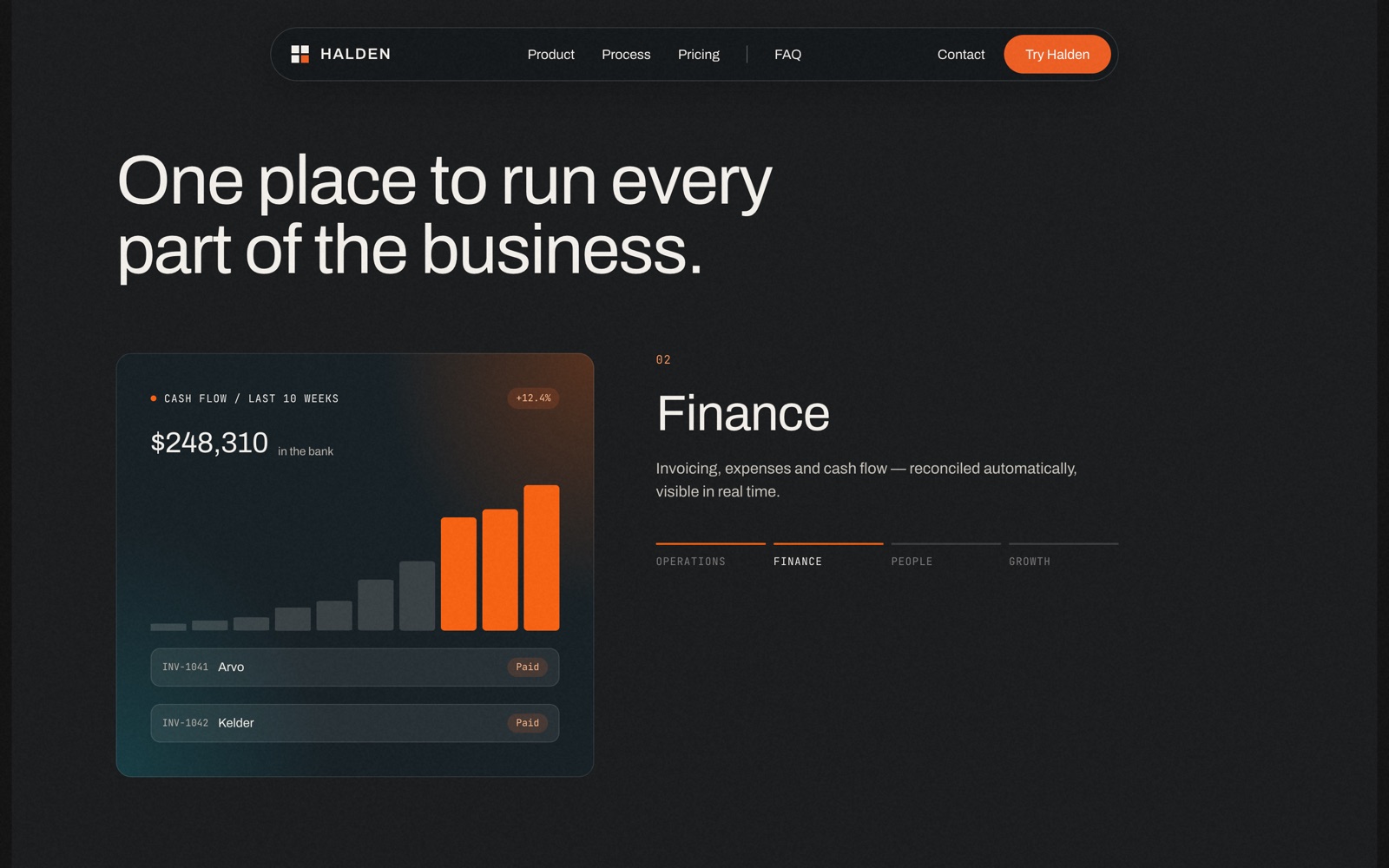
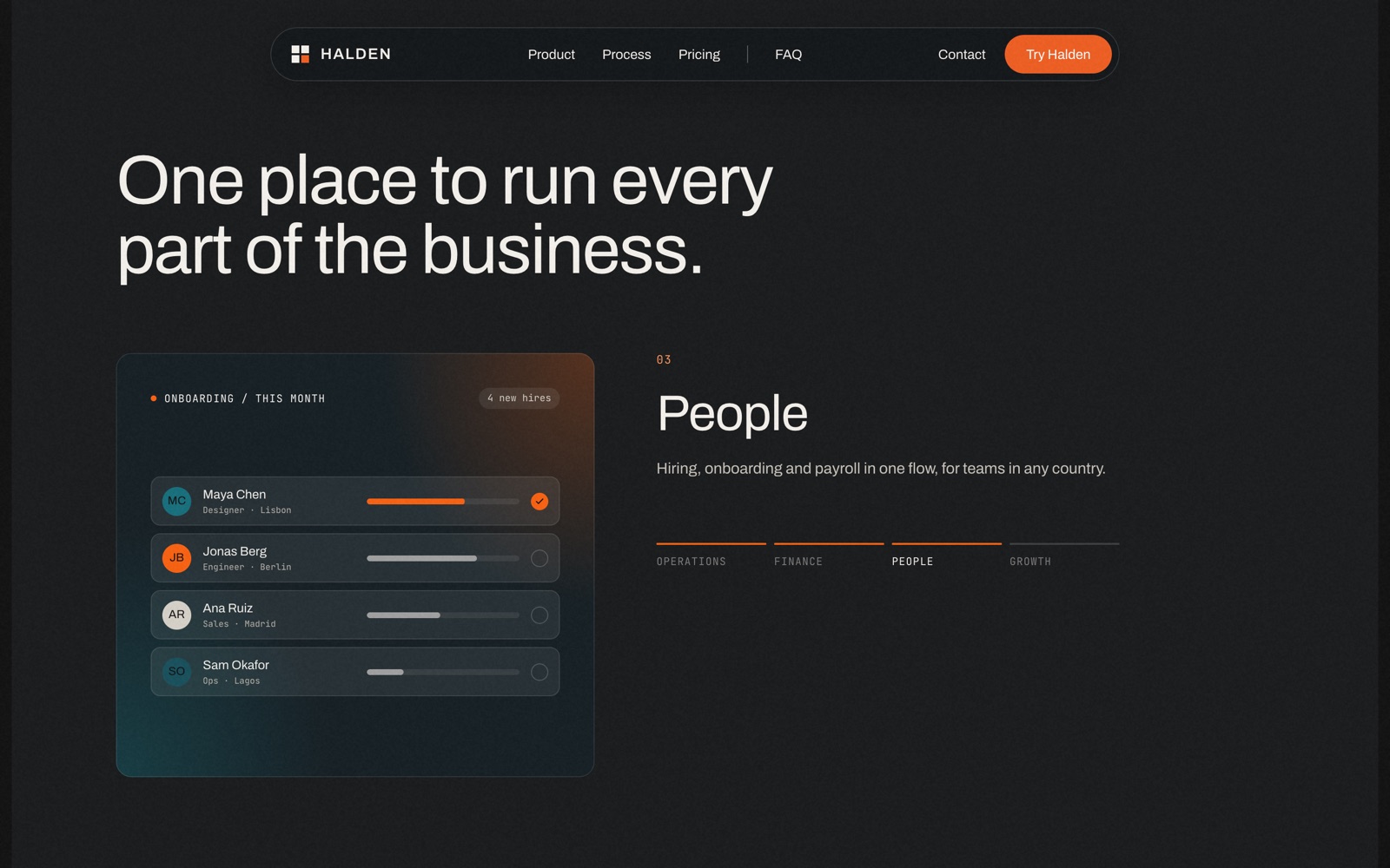
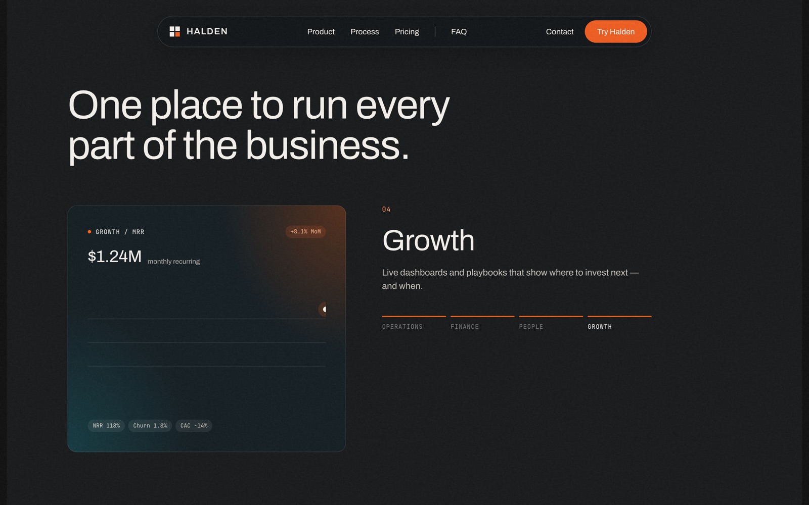
A SaaS page usually asks people to read four feature blocks in a row. Halden pins the product section to the screen and lets the scroll do the work instead: the headline stays put while Operations, Finance, People and Growth take turns in the same frame.
Each area arrives with its own mockup already moving - a launch timeline, a revenue chart, a team list, a growth curve - so the page shows one product doing four jobs rather than describing four products.
Every section has one job
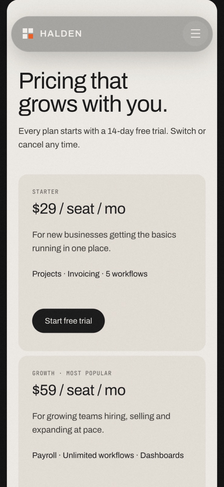
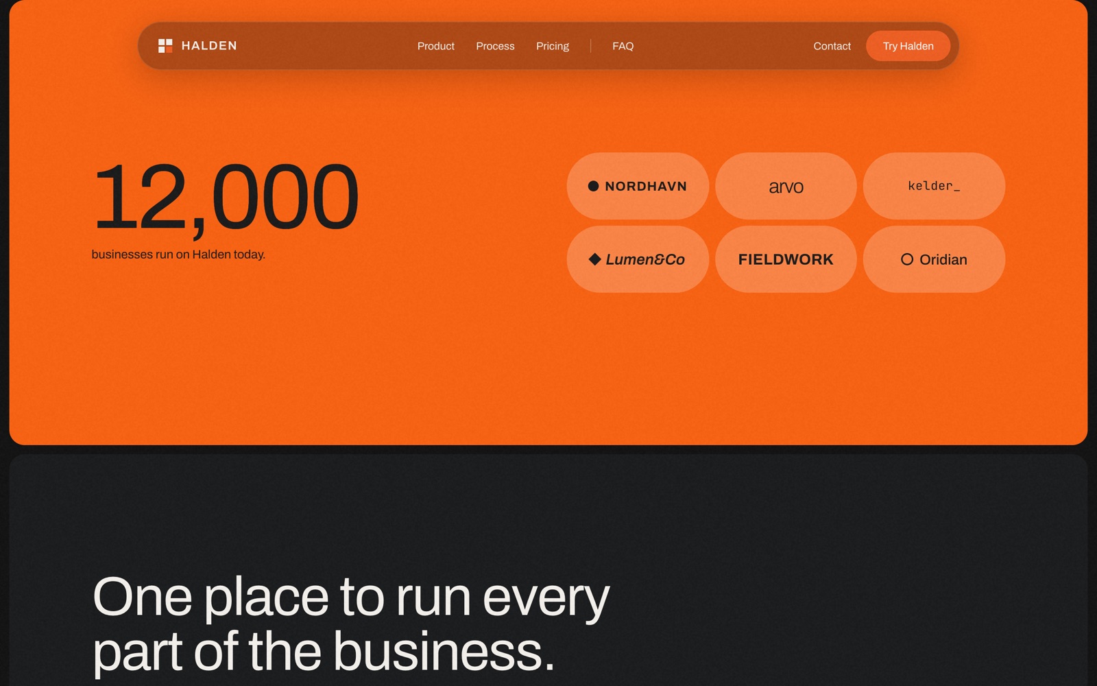
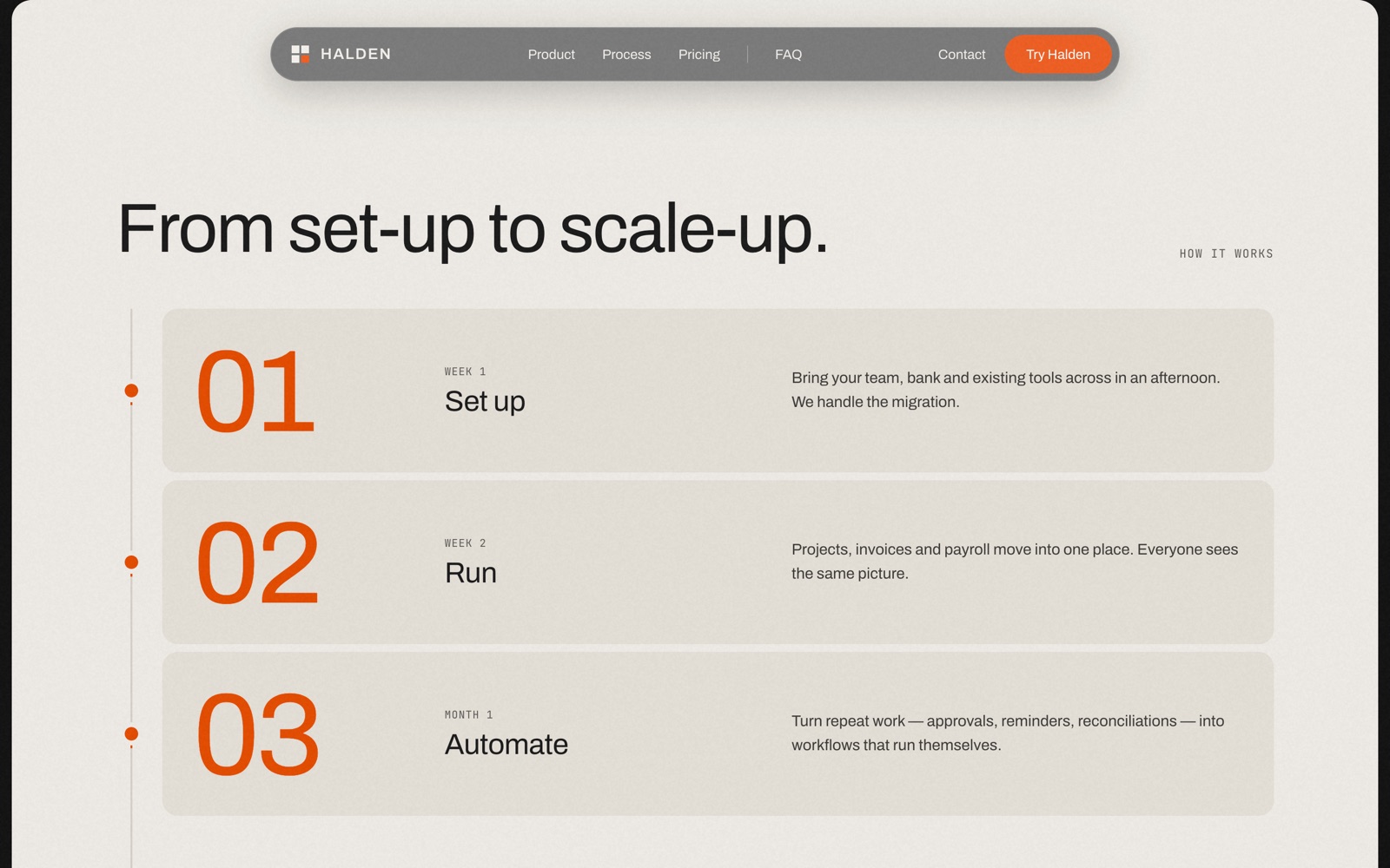
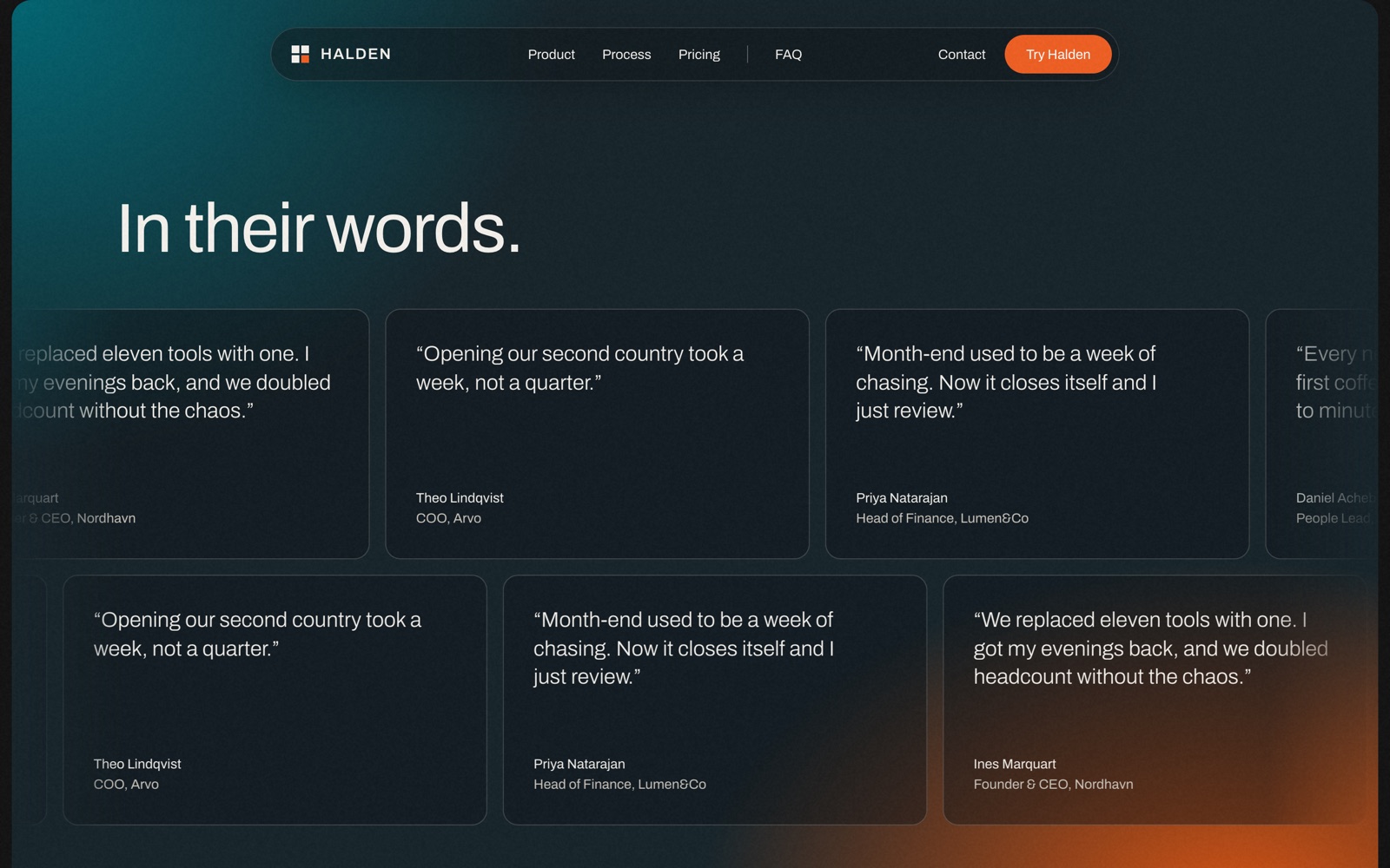
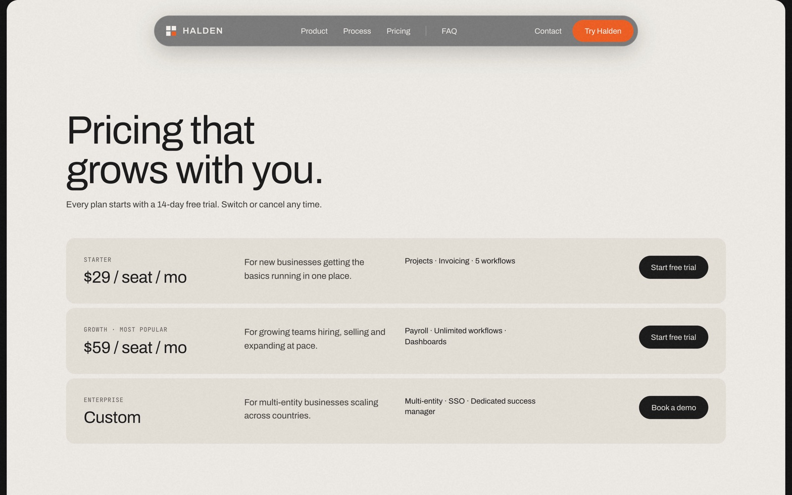
Social proof is a single number and a cloud of logos. The process is four numbered steps - set up, run, automate, scale - set on a light ground, the one break in the dark rhythm, so it reads as a pause rather than another feature. Testimonials run as a two-row marquee; pricing is three plans laid out as rows, so they can be compared at a glance without a table.
Forms that behave like product
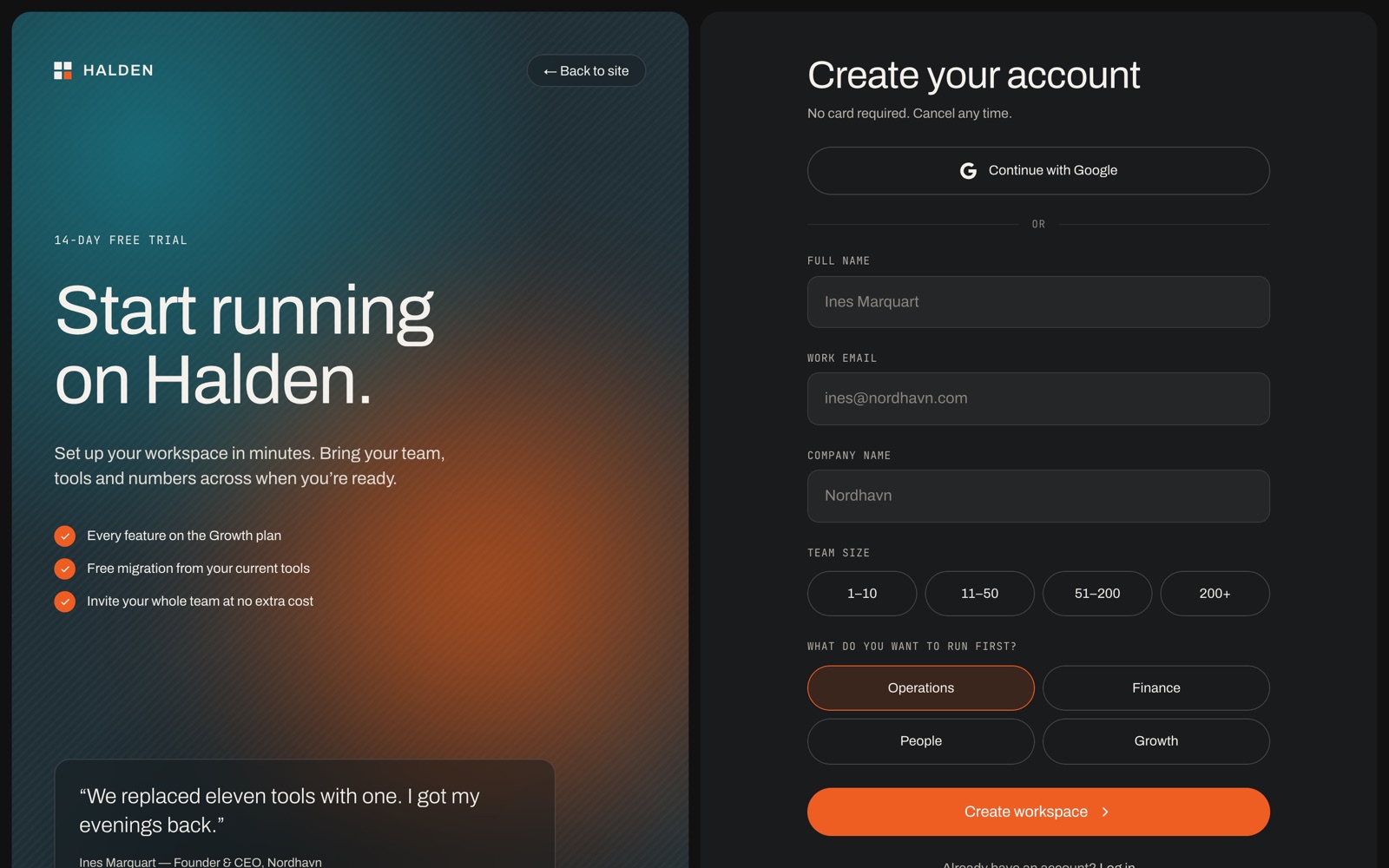
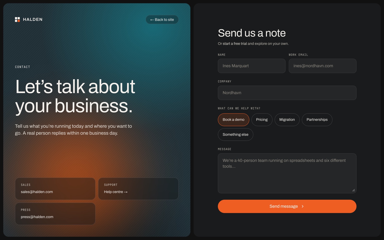
Sign-up and contact are the two places a visitor does something, so they are built to feel like the software rather than like a form. Choices are chips rather than dropdowns, and the submit button has a state for every outcome - pending, sent and failed - so nobody is left wondering whether it worked.
Native, so the person who buys it can change it
The first build leaned on code components: the nav, the preloader, the product mockups, the FAQ and both forms. They worked, but a template is bought to be changed, and a code component is a closed box to someone working on the canvas.
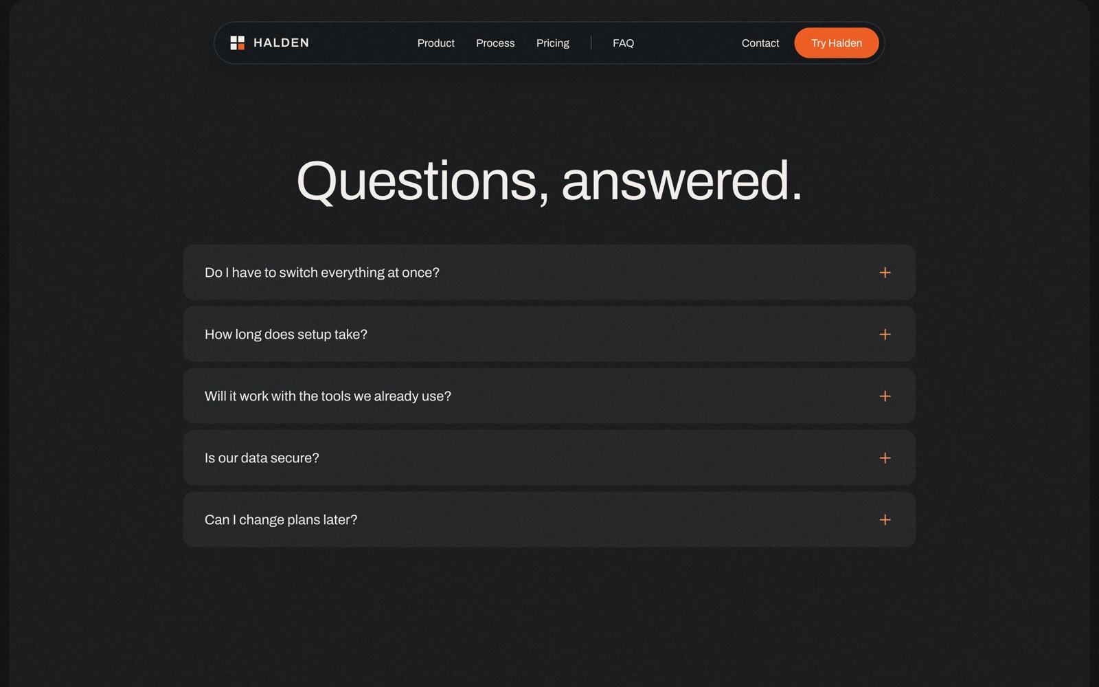
So I rebuilt every one of them natively - the nav that compacts on scroll, the preloader’s rolling counter, the mockup loops, the accordion, the form states - with no code components and no overrides. One type scale and one colour system are attached to every layer, so a rebrand is a change to the styles rather than a hunt through frames.
Laid out for the phone, not shrunk to it
At phone width the nav becomes a drawer, the type scale steps down, and every section reflows into a single column. It is the same page, rearranged for a thumb - the recording runs from the preloader to the footer.