Healthmov
Elevating brand and product around proactive, preventative health
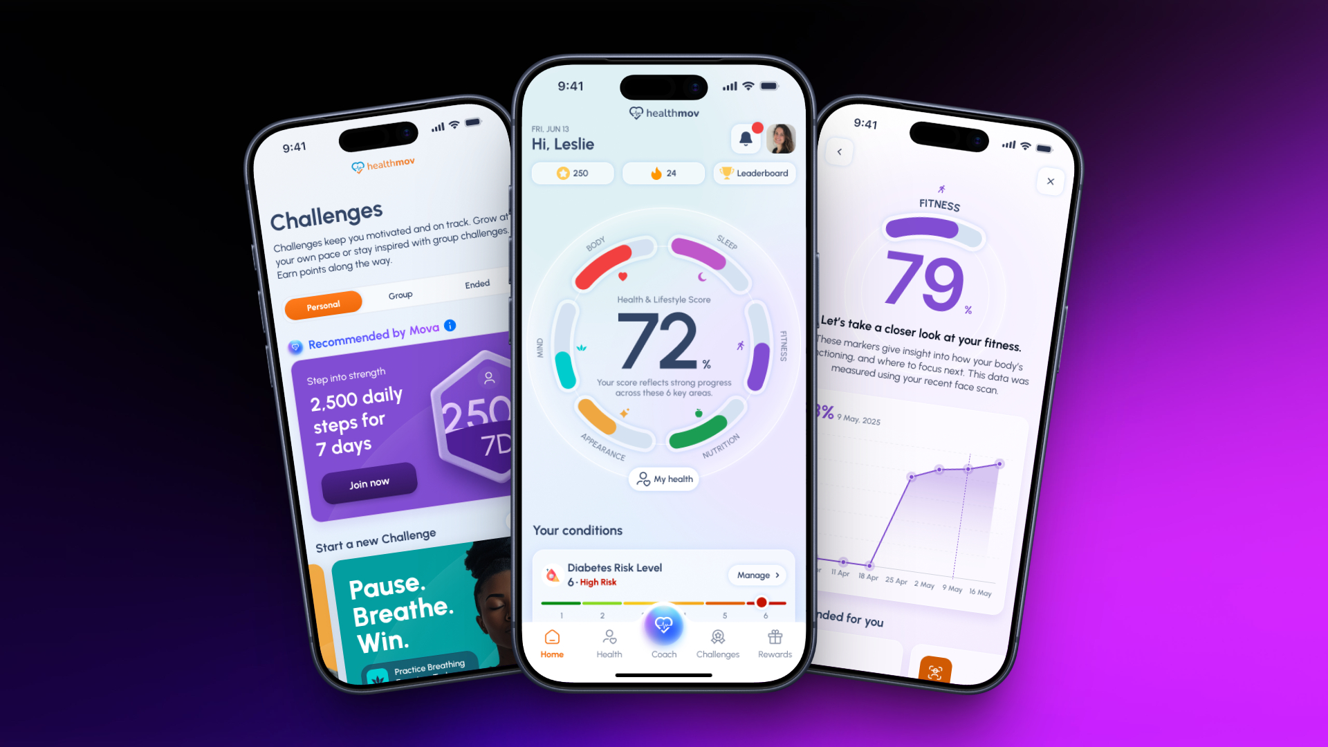
Healthmov is a health and wellbeing platform built for organisations - corporates, insurers, healthcare and government. It reads more than twenty-five health metrics, resolves them into one score a person can act on, and rewards measurable improvement rather than attendance.
I took Healthmov through a brand evolution and an uplift of the app experience - improving user journeys to reduce friction and surface content in a more personalised, engaging way. The work aligned Healthmov’s tone of voice, design approach and experience across channels, strengthening its position as a proactive health platform built for global impact.
Preventative health has a harder job than fitness tracking: it has to hold someone’s attention before anything is wrong. So I organised the redesign around one number and the honest measures behind it, rather than around the data the sensors happen to produce.
- The redesigned app experience, end to end across every surface
- A single Health & Lifestyle Score, and the four measures that compose it
- Mova - the AI coach, and the conversations it opens with
- Risk and results presented plainly, on scales that say where you sit
- Challenges, streaks and a rewards economy that pays for improvement
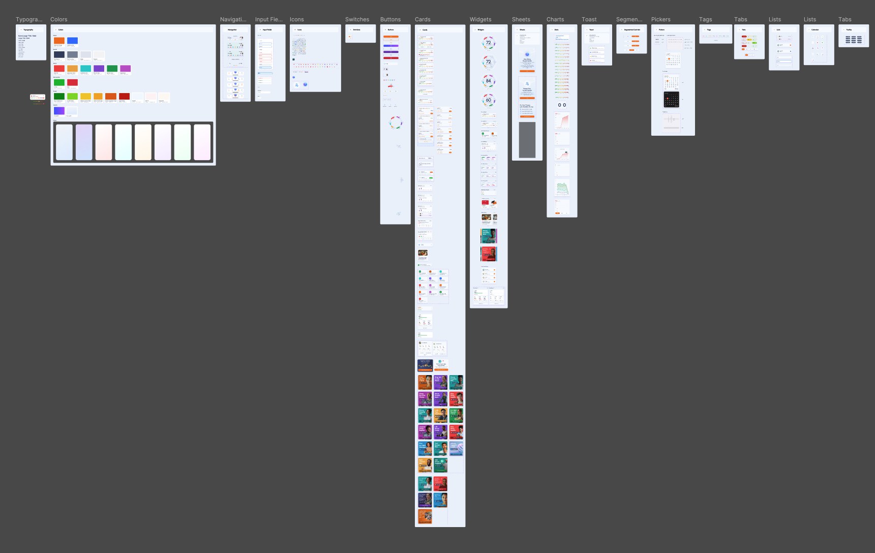
- The design system the whole product is drawn from
One number, and every measure behind it
Home opens on a single Health & Lifestyle Score, ringed by the four areas that compose it - fitness, nutrition, mind and appearance. It is the whole argument of a preventative product in one object: a person who is not ill has no symptom to check, so the score is what gives them something to watch.
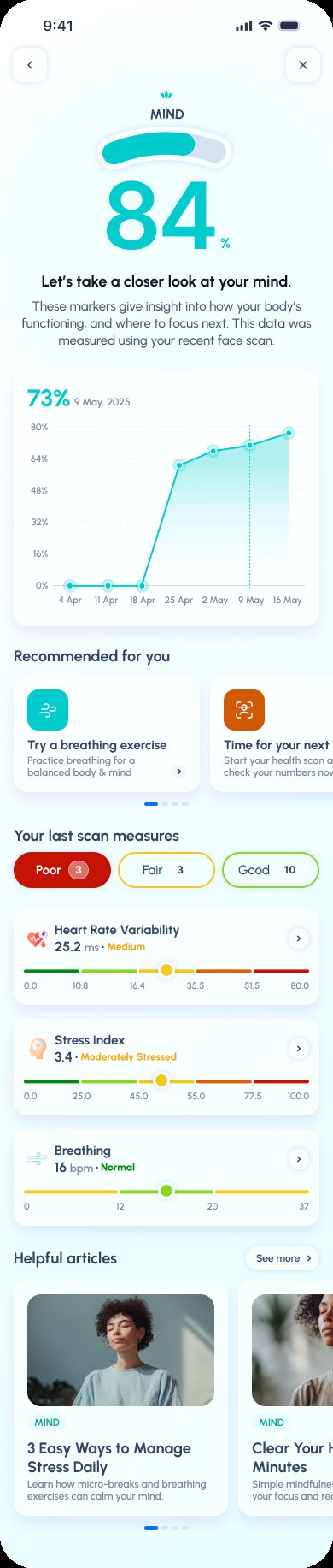
Every area opens into its own reading - a trend line, the measures that produced it, and where each one sits on a banded scale. Nothing is a figure you have to take on faith, and nothing is shown as good or bad without the range that makes it mean something.



Mova asks before it advises
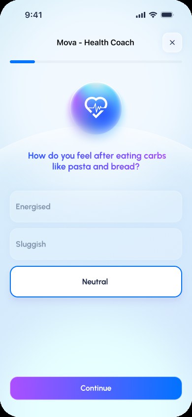
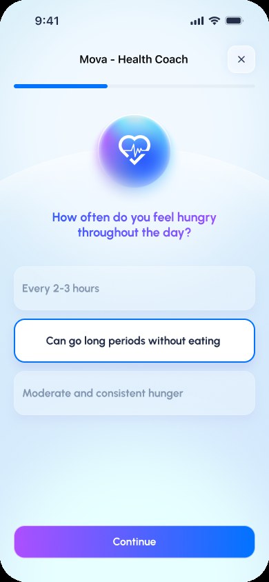
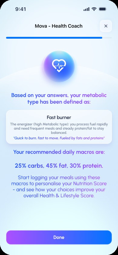
The AI coach does not open with a recommendation. It opens with questions a person can actually answer - how do you feel after eating carbohydrates, how often are you hungry - and only then names a metabolic type and the macros that follow from it.
That order is the point. An assistant that leads with a verdict has to be trusted before it has earned anything; one that asks first arrives at the same advice with the user already in it.
Risk, stated plainly
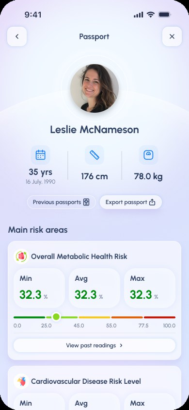
The passport is the clinical face of the product: age, height, weight, and the main risk areas with their minimum, average and maximum readings on a 0–100 band. It can be exported, and previous passports are kept - because a risk figure with no history is a number, not a direction.
The same discipline runs through the scores. Nutrition resolves to one figure and then opens into every macro and micronutrient behind it; mind reads heart-rate variability, stress and breathing rather than asking somebody to rate their mood out of ten.

Logging a meal without counting one
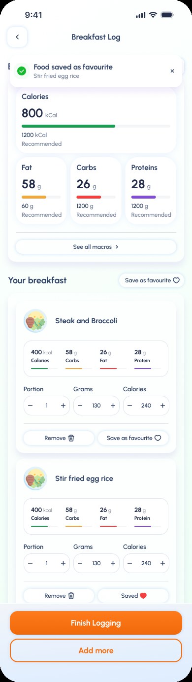
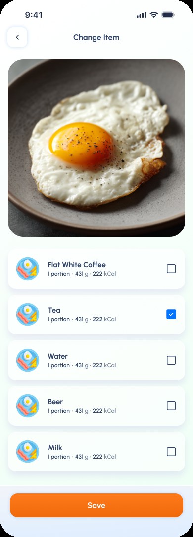
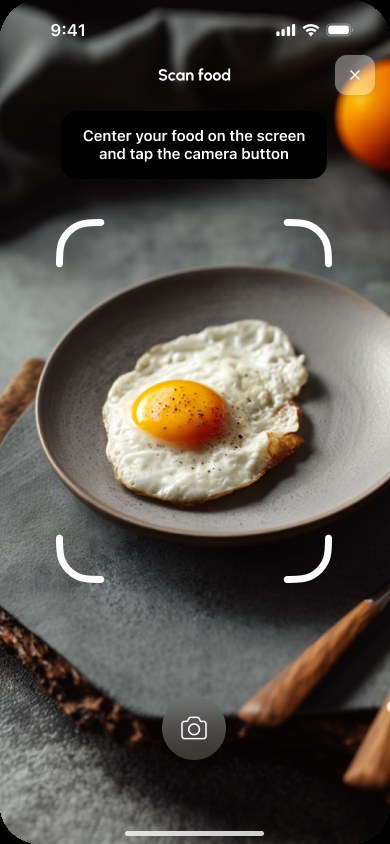
Food is where health apps lose people, because the honest version of it is data entry. Here a meal starts with the camera: frame the plate, and the log comes back filled in with portions, grams and calories to adjust rather than type. Anything eaten often can be saved as a favourite, so the second time costs a tap.
A reason to come back tomorrow
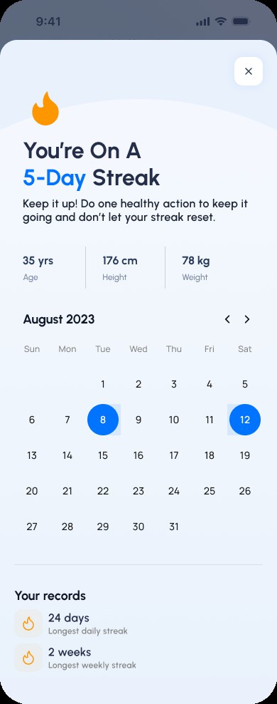
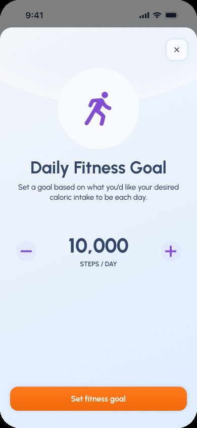
Engagement is the whole commercial case for preventative health - an organisation only sees a return if people keep using it. Challenges run personally or as a group and are suggested by Mova from what somebody already does; streaks are shown with the record to beat rather than only the run in progress; and goals are set by the person, not assigned to them. Healthmov reports an average 72% engagement rate across its users globally.

Announcing the redesign from inside it
A brand evolution that nobody notices has not landed. The new experience introduces itself on first open - what changed, why, and what is still coming - and says so in the voice the rest of the work established, rather than in a release note.

The system underneath
Typography, colour, navigation, inputs, icons, switches, buttons, cards, widgets, sheets, charts, toasts, segmented controls, pickers, tags, tabs, lists and a calendar - the library the product is drawn from, so a screen added next year still looks like it belongs.