Moxie
A companion that levels up every time you do
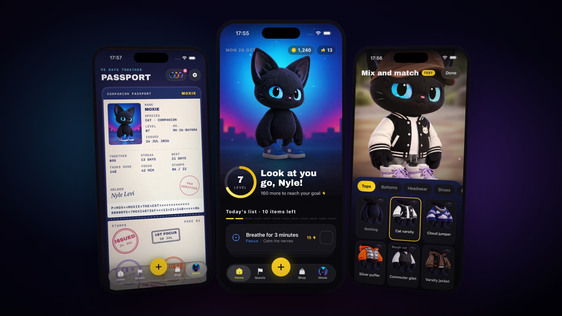
Moxie is my own product - a to-do list and focus timer with a companion attached. A black cat as a vinyl designer toy, who levels up when you do, wears what you have earned, and keeps a passport of everything you have done together. It is a working native iOS build, not a prototype: every screen here was taken from the app running.
Companion apps are pastel and kawaii, and they are all aimed at the same person. Moxie is deliberately the other thing - a black cat in streetwear, night-city light, a cyan rim that is the character’s signature - because it is built for people who bounce off to-do apps and would be embarrassed to be seen using the soft ones.
That decision has to hold everywhere. Moxie must read as the same character in every outfit, pose and corner of the app, at the quality of the master art, or the companion stops being a companion and goes back to being a progress bar.
Bolts measure what you did. They fill the level ring and are never spent. Coins are what you spend - outfits, backgrounds, streak repairs. The split is the whole economy: bolts come from everything, so every small thing counts, while coins come from levels, quests and real focus, so what you buy feels earned rather than farmed.
Ticking a task off is self-reported and cannot be checked, so a tick pays bolts only, never coins. That one rule is what stops the rewards cheapening.
- The product, the daily loop, and the economy behind both
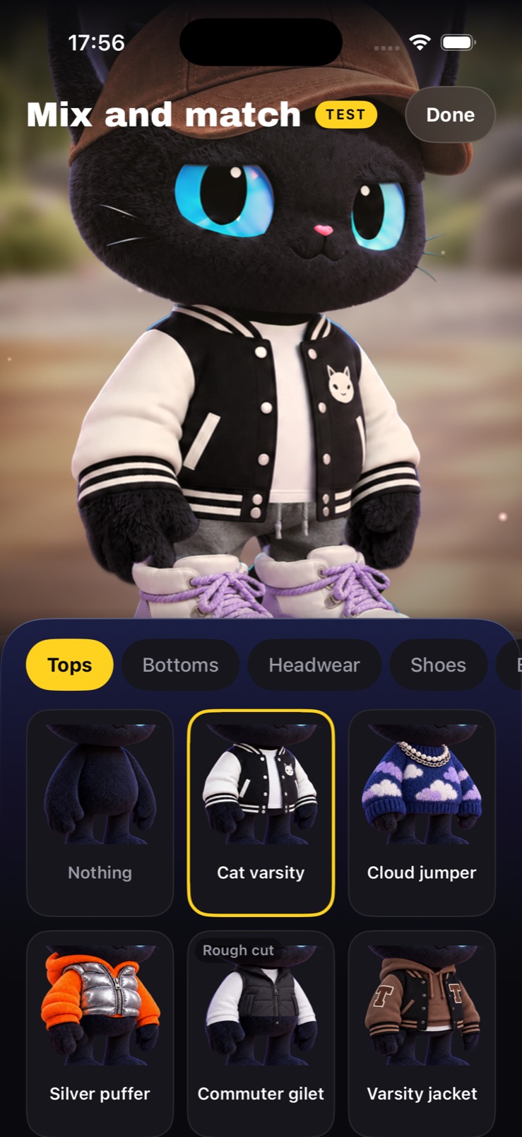
- A companion system where tops, bottoms, headwear and shoes combine freely
- Every screen in the app - list, focus, quests, shop, passport, friends, settings
- The companion passport: a record of a relationship rather than a stats page
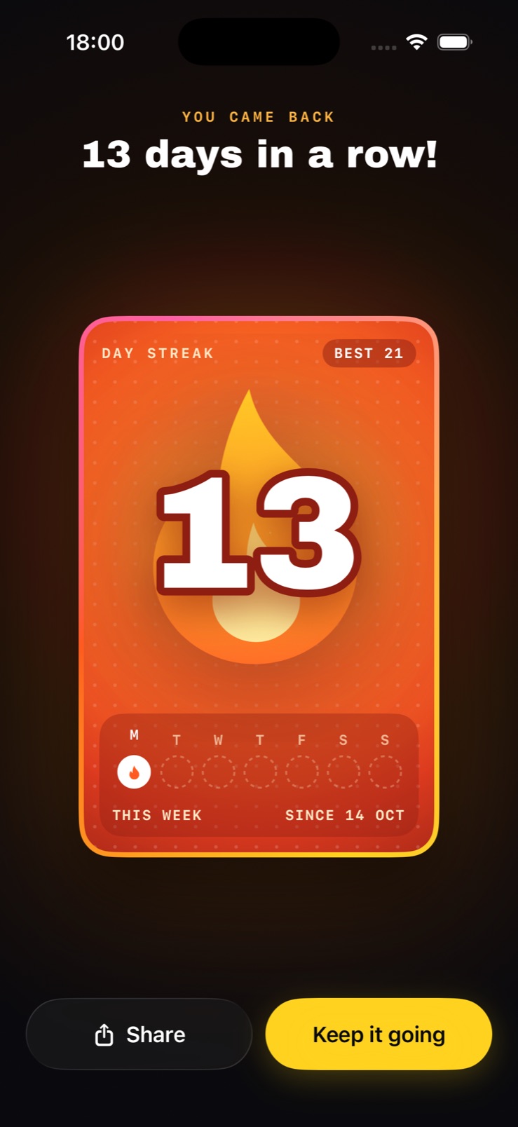
- Streak, celebration and share moments built to leave the app
- The native SwiftUI build itself, with a home-screen widget
Day one is a passport being issued
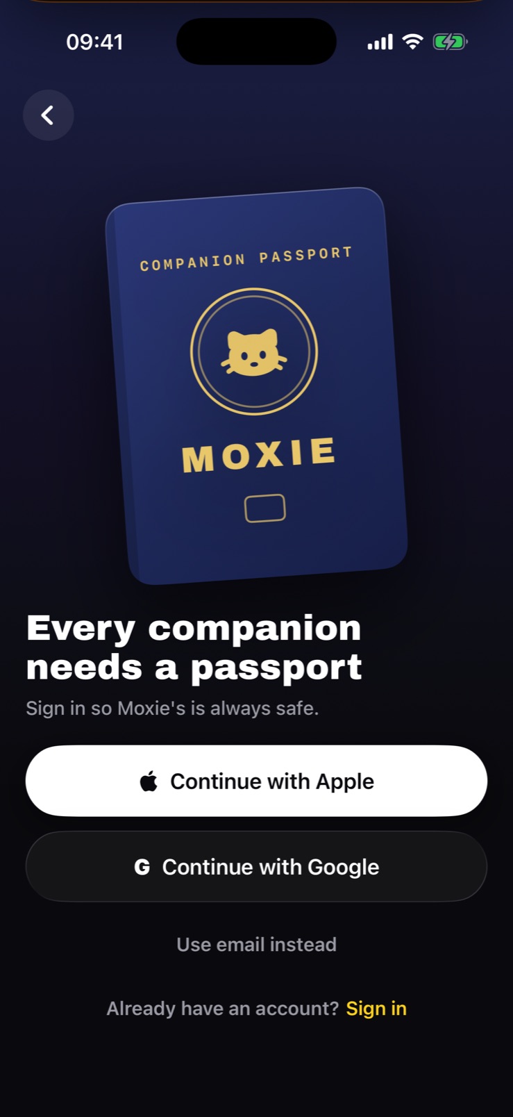
Onboarding asks very little and spends what it saves on what it hands back. Signing in is framed as the one thing an account is for - every companion needs a passport, and signing in keeps it safe - rather than as a form standing between you and the app.
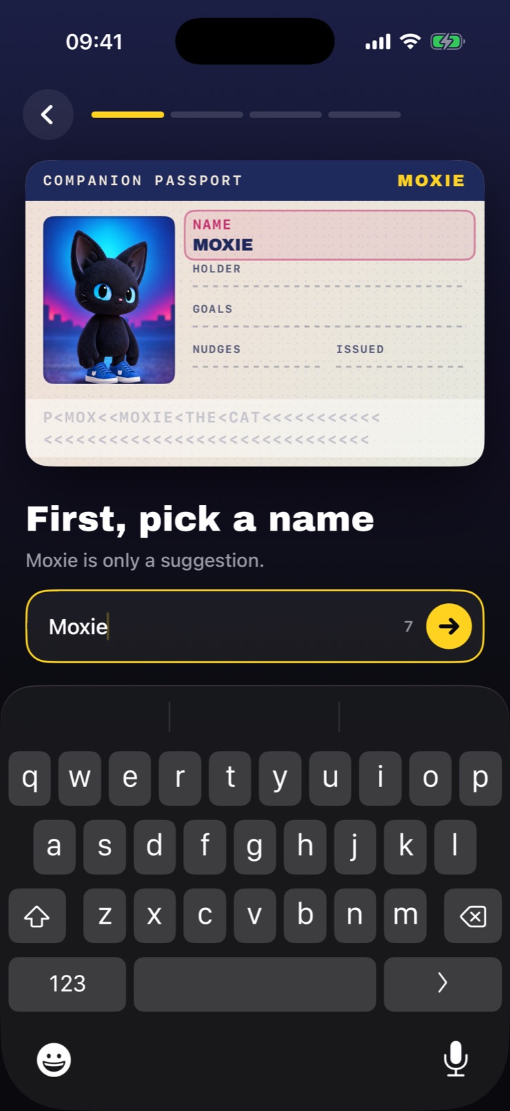
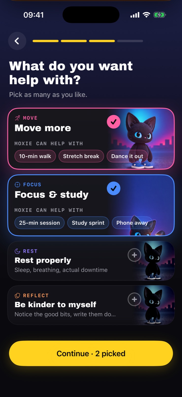
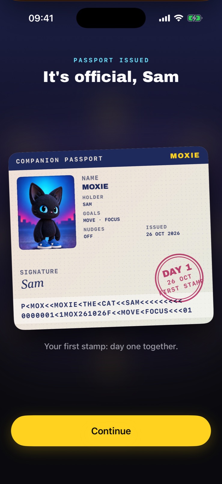
Then the passport stays on screen while you answer, and each answer lands in its field as you give it: the companion’s name (Moxie is only a suggestion), yours, what you want help with. It ends with your signature and a Day 1 stamp. Nothing has been earned yet, and that is the point - the book exists from the first minute, so every later stamp has somewhere to land.
Moxie first, the list second
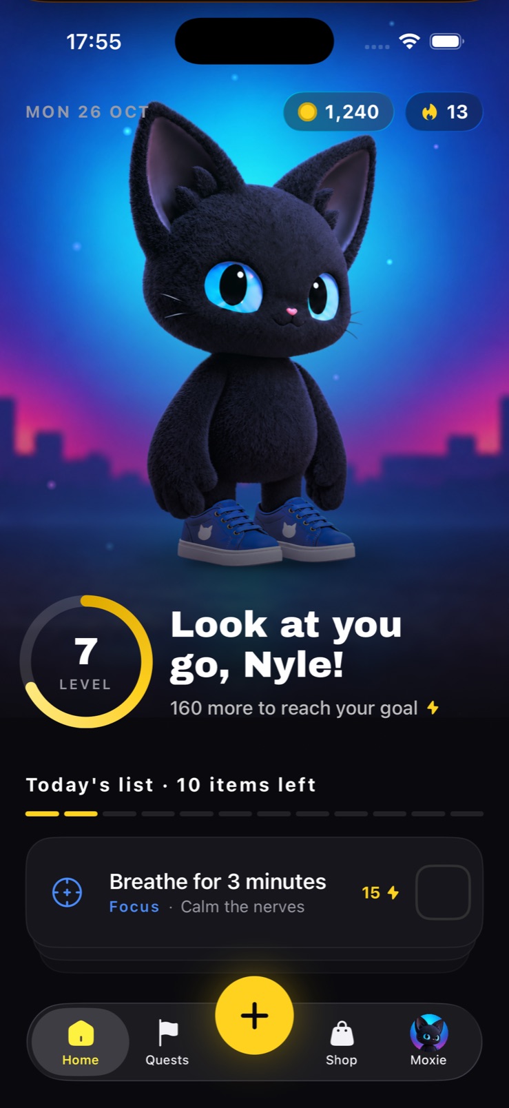
Home gives the companion the whole upper half and the list what is left. Most apps of this kind do the reverse, which is why they feel like admin: the list is the work, and the work is not what brings anyone back tomorrow.
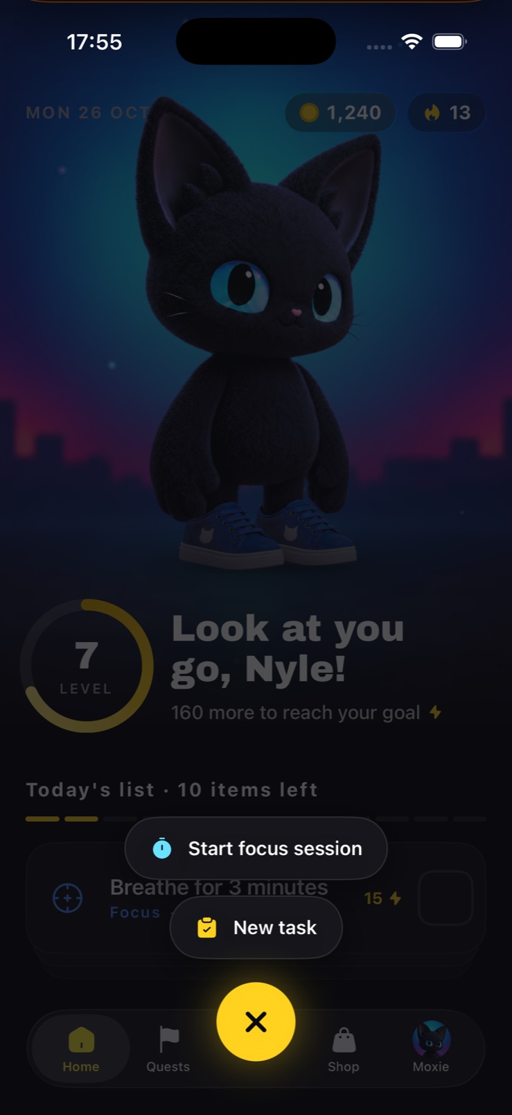
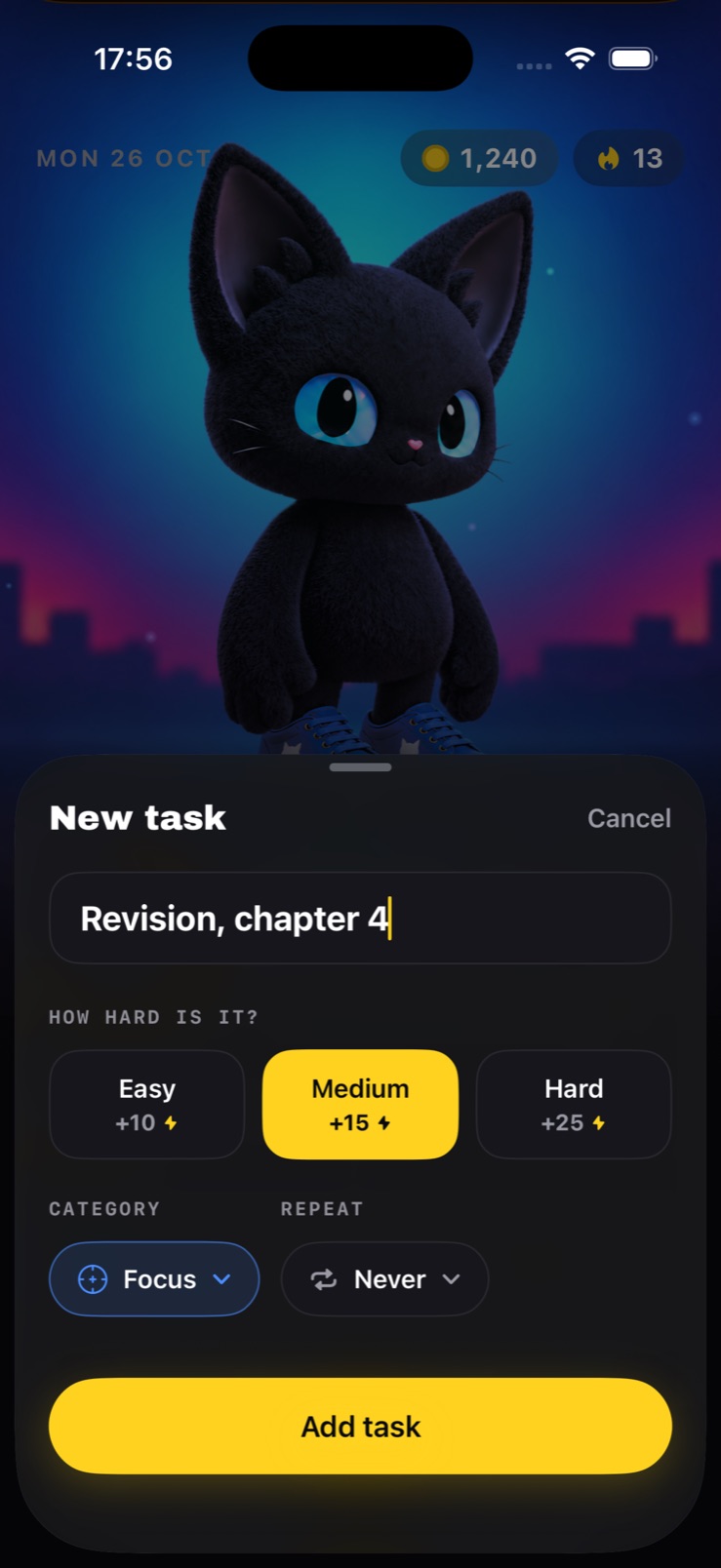
Everything that would normally be a dashboard is folded into furniture around the character - coins and streak as two chips, a level ring, a sentence that uses your name. There is deliberately no add button on the list itself. The big yellow + in the tab bar is the only way in, and it offers two things, because a timer and a task are the only two things this app does.
Focus, with somebody at the desk
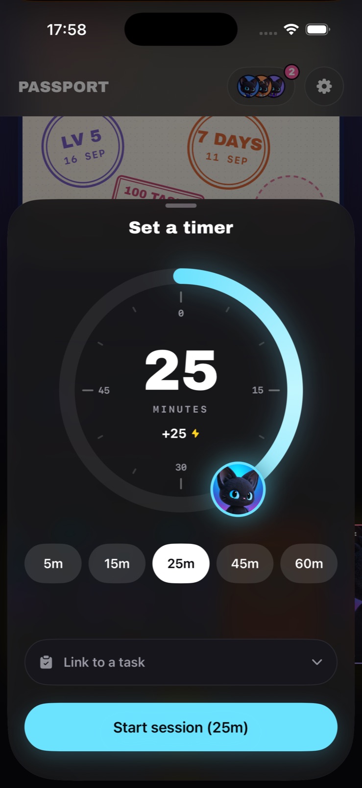
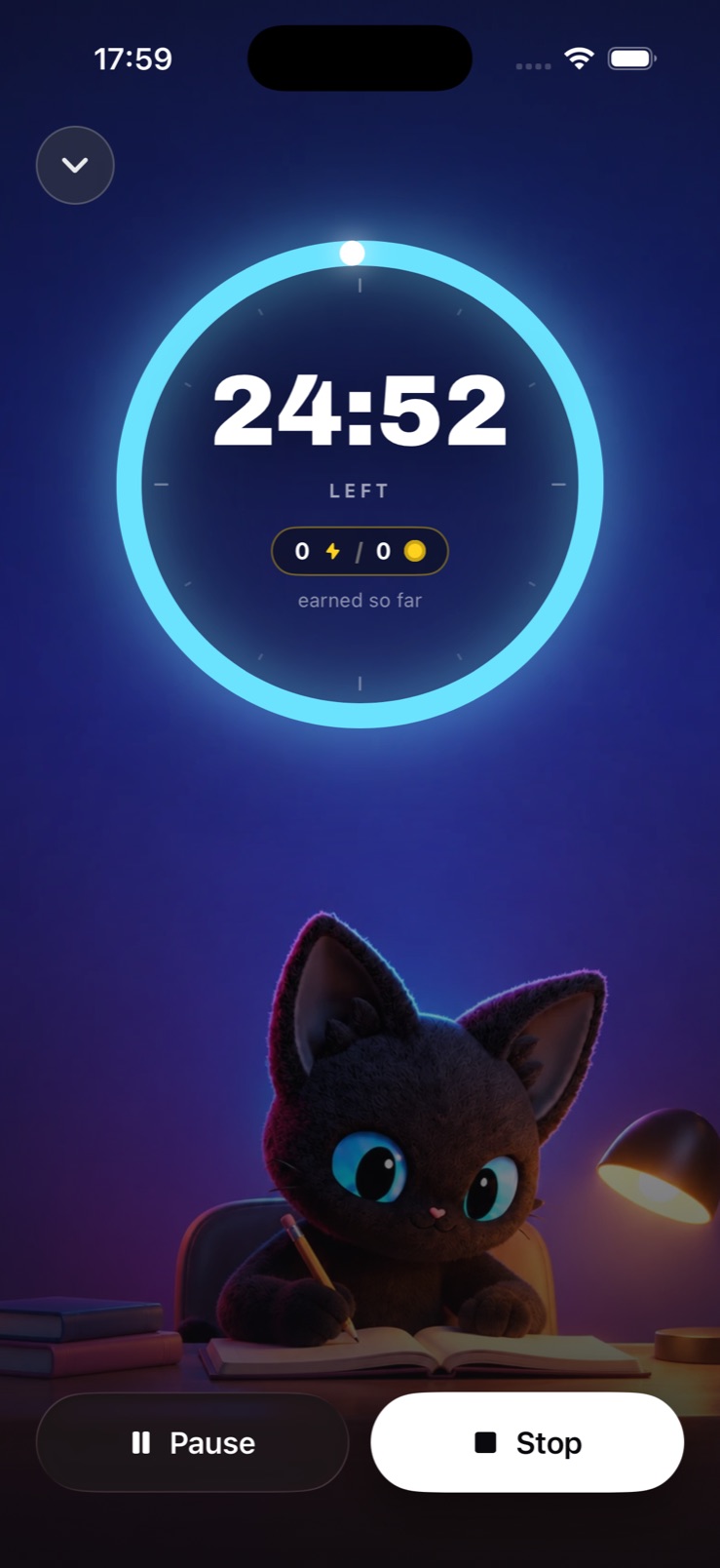
A timer is the easiest screen in the world to make lonely. Moxie sits in the scene doing the same thing you are, at a desk under a lamp, so the session has company rather than a countdown. Setting one up puts Moxie’s own face on the dial as the knob you drag.
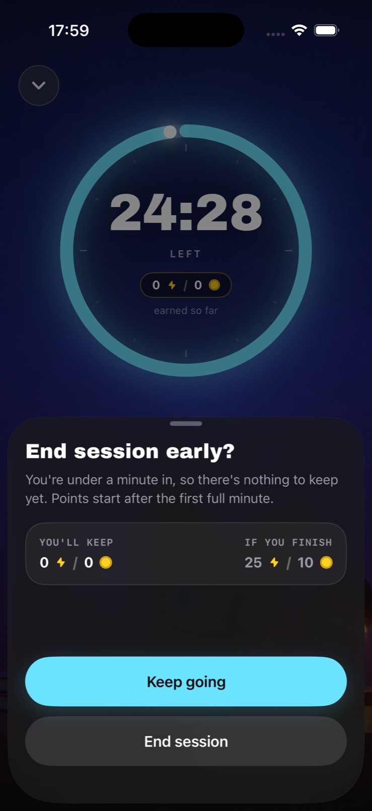
Stopping early is where the honesty is. Rather than a yes/no alert, the sheet shows what you would keep against what finishing would pay, and names the rule plainly - nothing is earned in the first minute. Quitting stays available and stays unpunished; it just is not hidden from you what it costs.
A passport, not a stats page
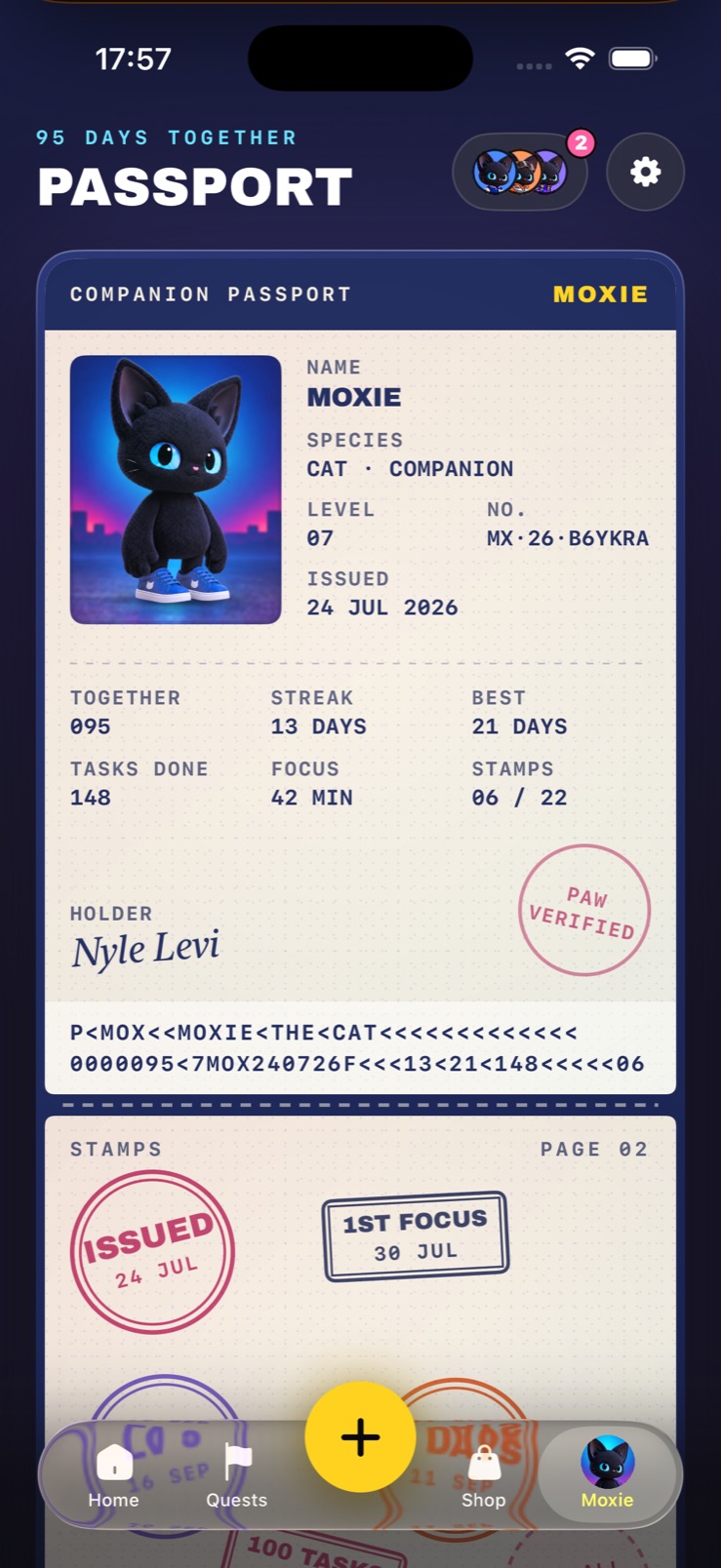
Every app like this has a statistics screen and nobody opens it twice. The passport is the same numbers given a form people already understand: days together, streak, best, tasks done, focus time, stamps - issued, numbered, signed by the holder, verified with a paw.
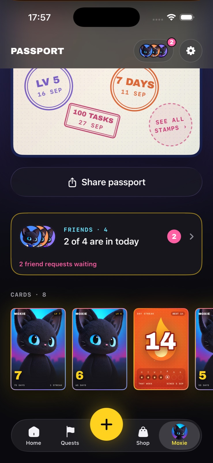
Then it accrues. Stamps land for levels, streaks and hundreds of tasks; cards from level-ups and streaks collect on a shelf underneath; the whole thing can be shared. The test is not whether the numbers impress anyone but whether the book is worth keeping, and a book fills up in a way a dashboard never does.
Earning the look
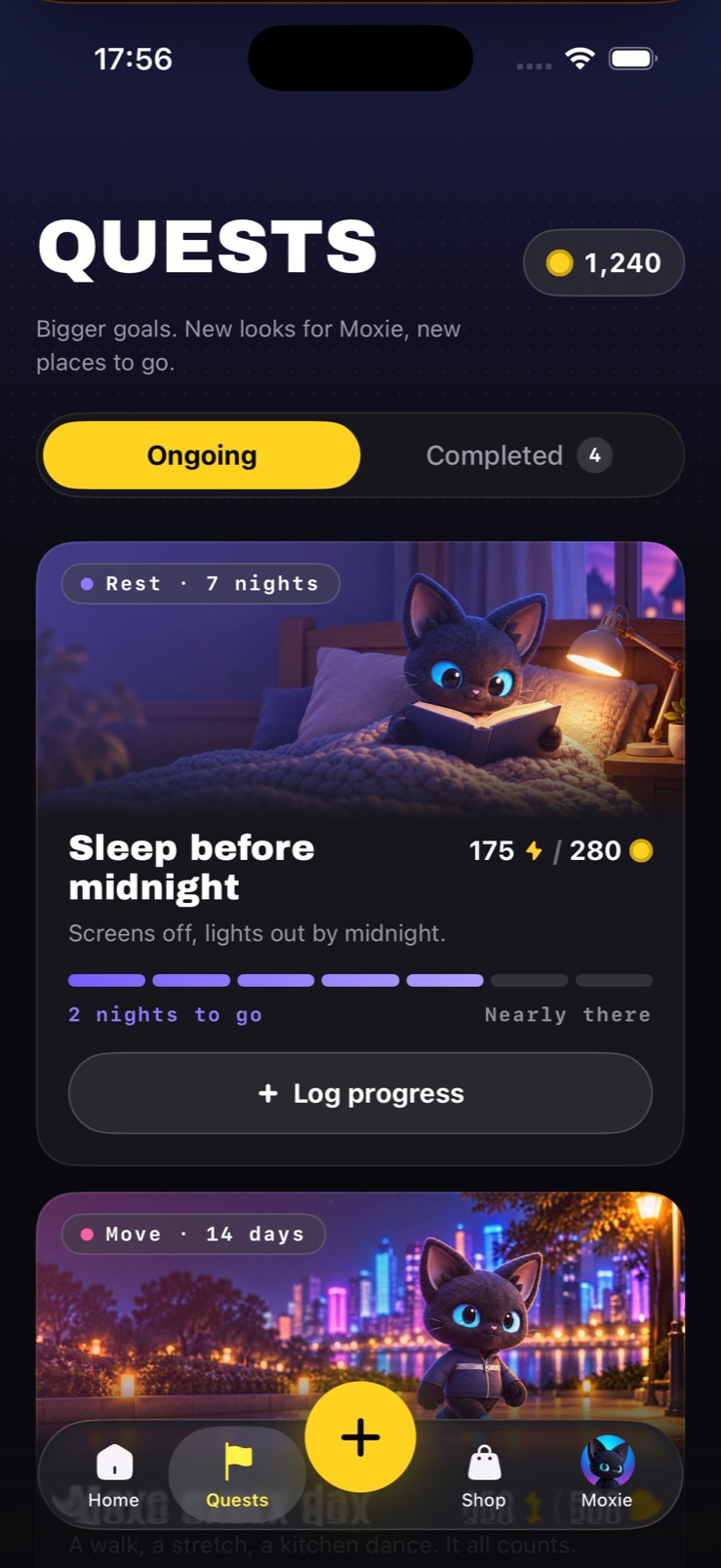
The wardrobe is the economy made visible. Quests are the longer arc above the daily list - sleep before midnight for seven nights, move for fourteen days - and they pay in both currencies, so a week of effort buys something that changes the character you see every morning.
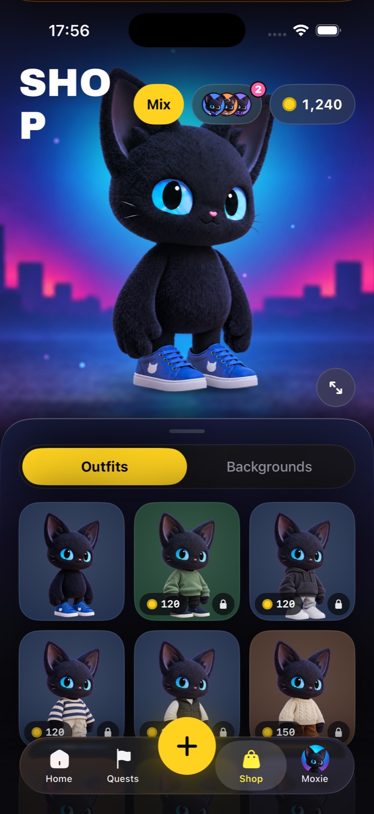
In the shop the preview is Moxie, full height, in the place you have chosen, rather than a flat lay. Prices sit on the items and locked ones stay visible. Behind it sits the piece system I am proving out: tops, bottoms, headwear and shoes made once each and combined freely, so the hundredth jacket costs no more to add than the first.
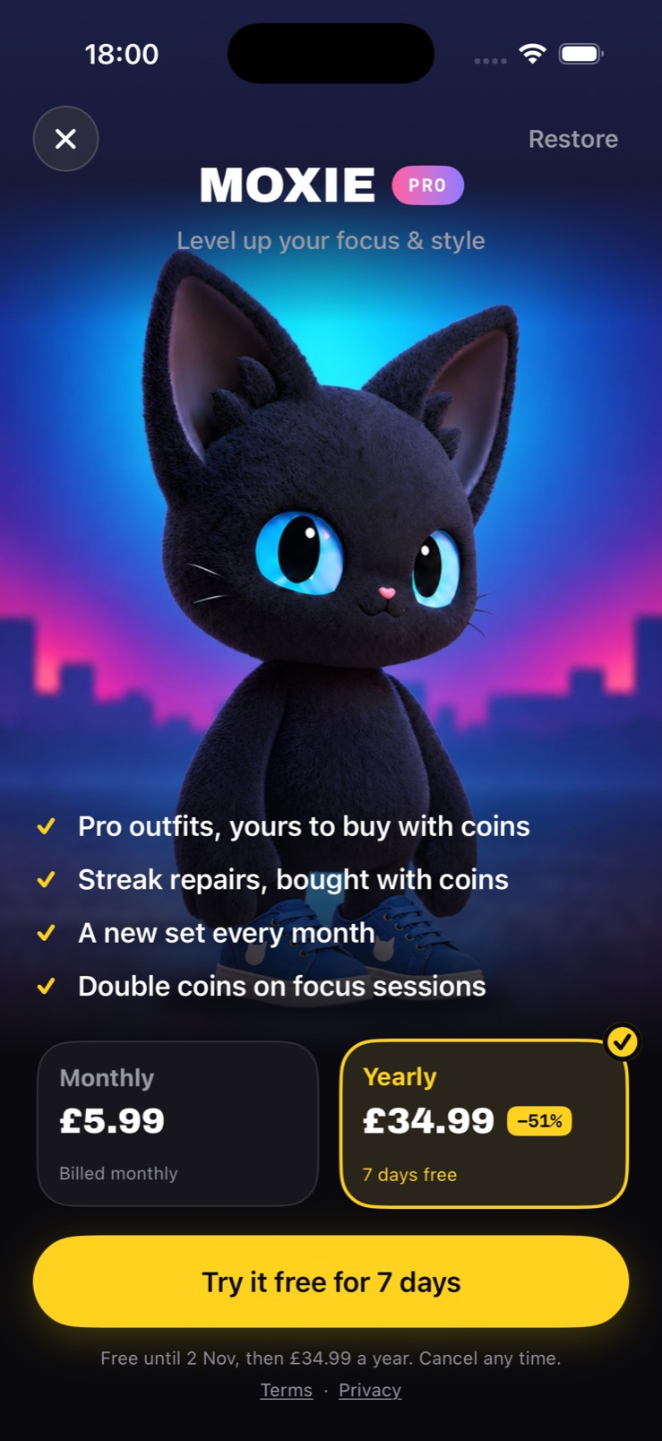
Pro sells two things and says so in four lines - Pro outfits to buy with coins, streak repairs, a new set each month, double coins on focus. It never sells progress. Nothing on that screen lets anyone skip the part where you did the thing.
Friends who can only be kind
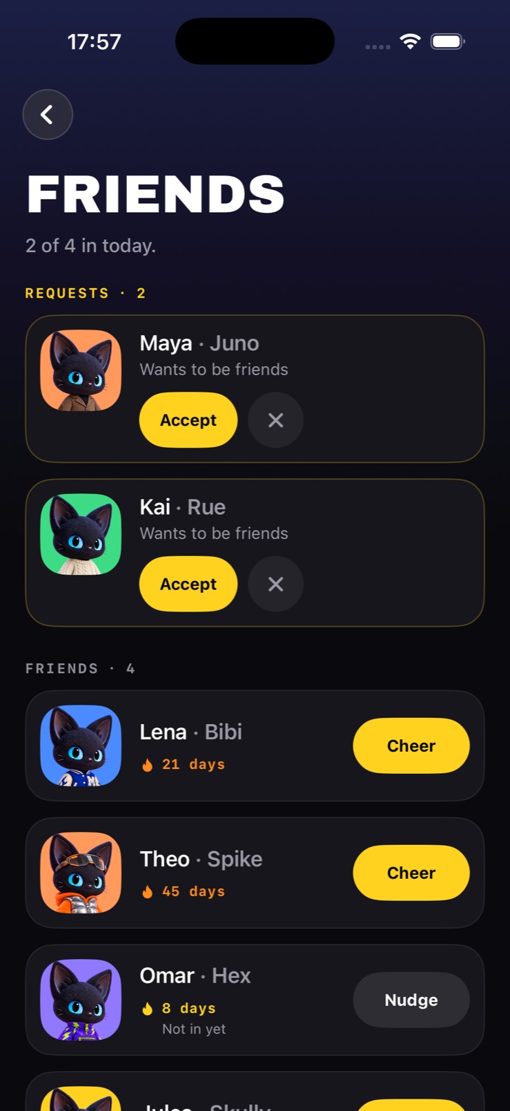
The social layer has two verbs and no others. Cheer someone who has already been in today; nudge someone who has not. There is no feed, no league table and no way to be unpleasant to anybody, because the moment an app like this lets people rank each other it becomes a different, worse product.
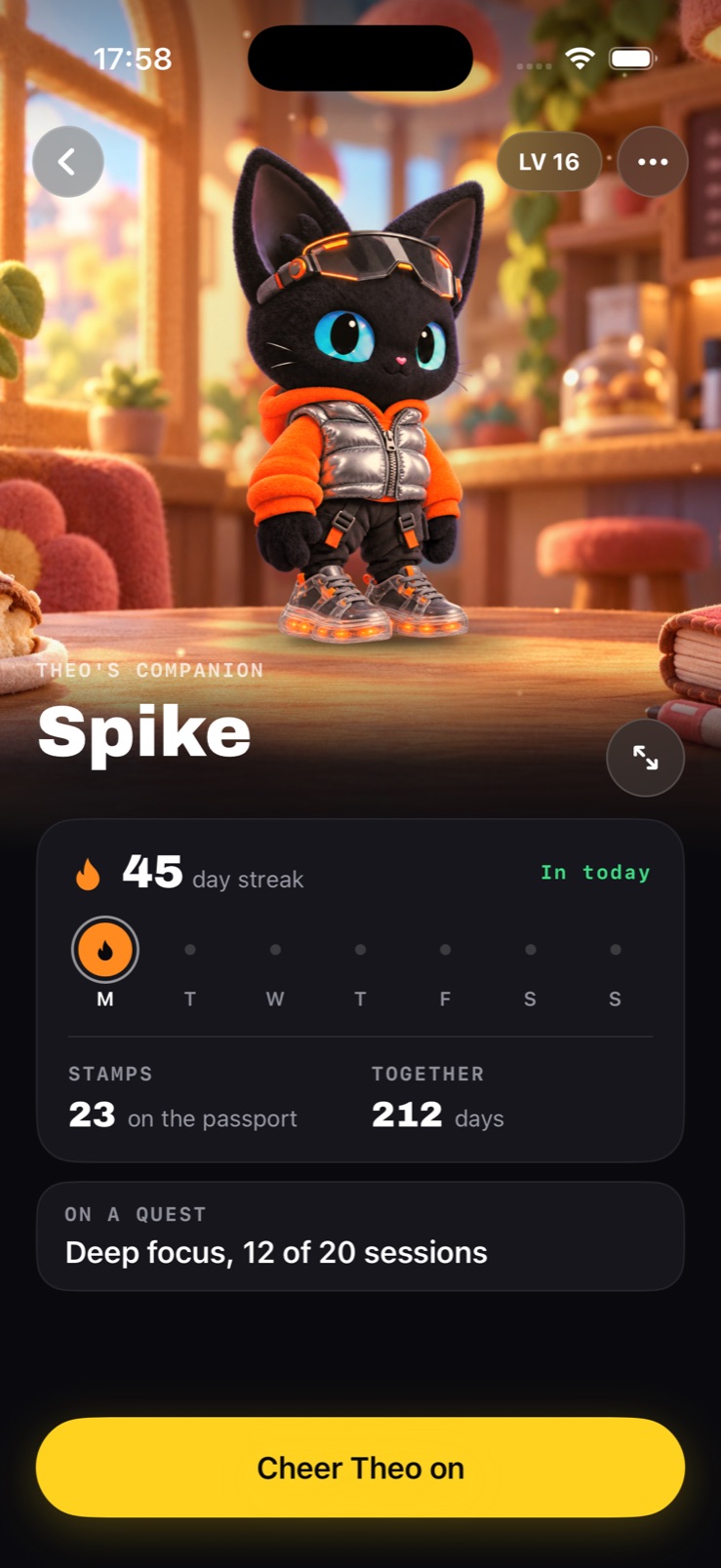
A friend’s page is their companion in their outfit, their streak, their week, and what they are working on - then one button. Each friend can be cheered once a day, so the gesture keeps meaning something.