Kova
A twenty-page site for a smart-home energy app
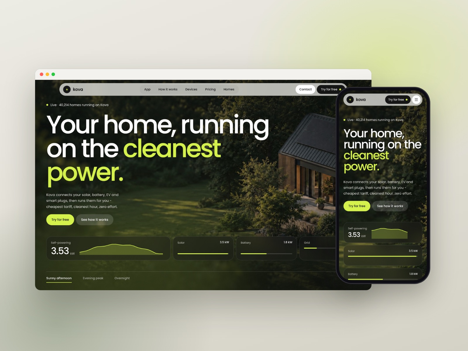
Kova is a Framer template I designed and built for a smart-home energy app: one that connects solar, a home battery, an EV charger and smart plugs, then runs them on the cheapest tariff and the cleanest hour. Twenty pages and nine CMS collections, with every interaction built natively so it can all be changed on the canvas.
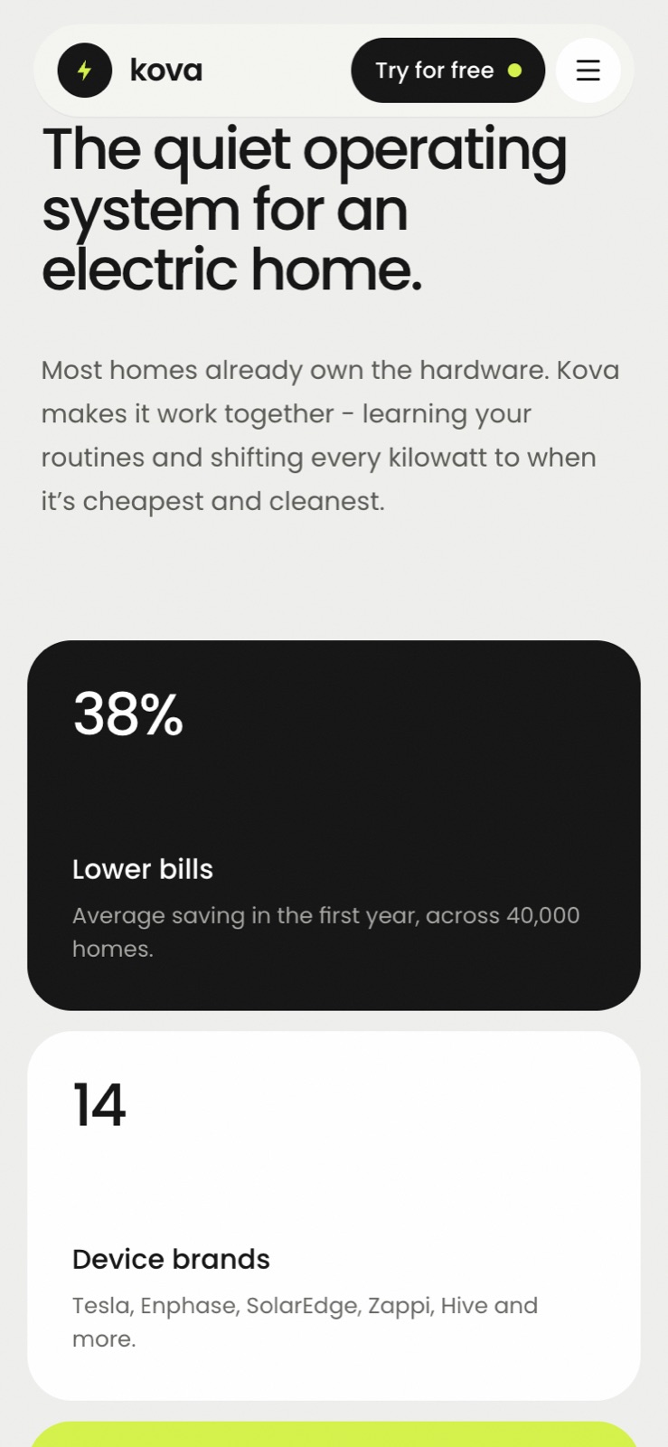
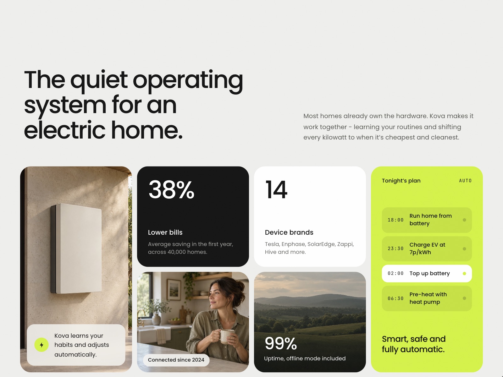
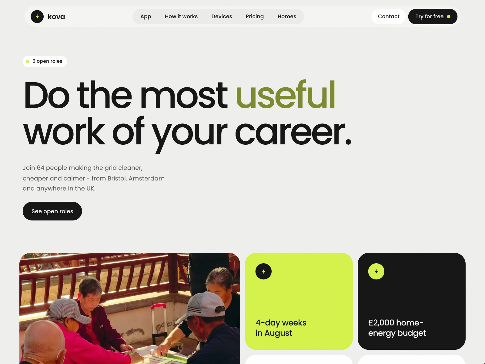
Home energy is usually sold with diagrams and jargon. Kova goes the other way: a calm light palette, one electric-lime accent, big confident type and photography of real homes, so it reads as a consumer product people would want in their house rather than a utility.
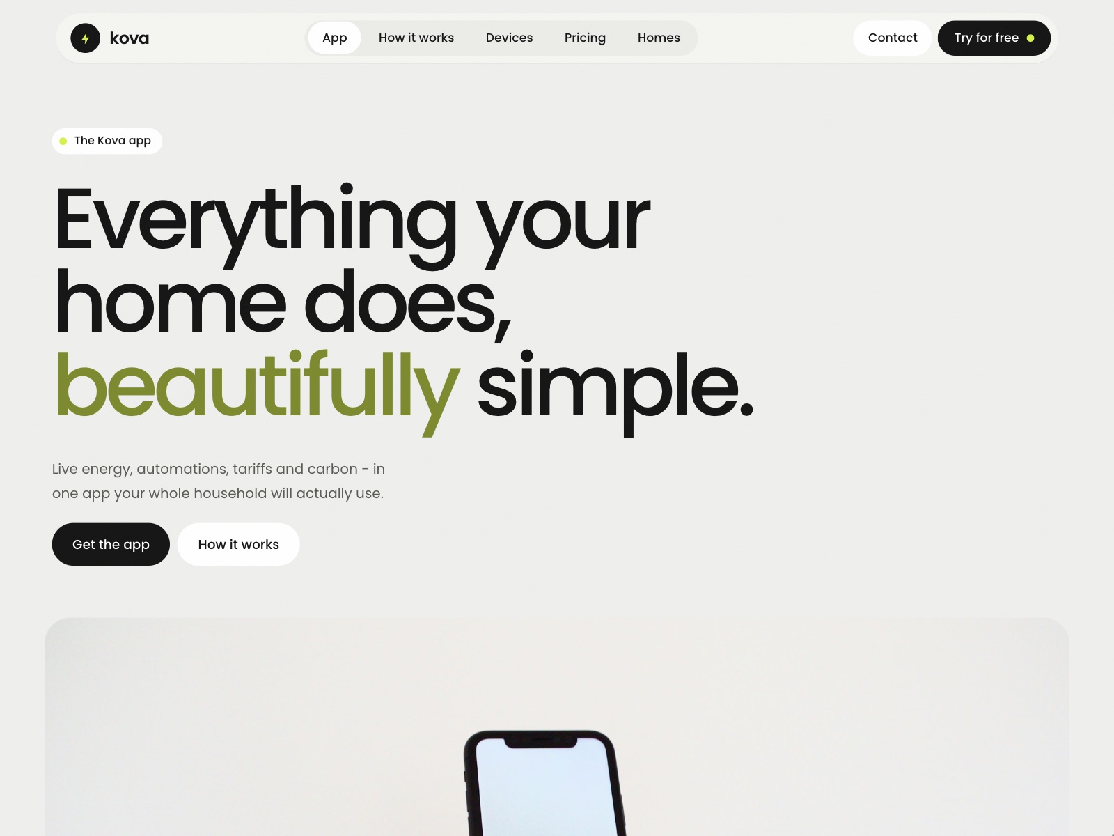
The site makes the product visible before it describes it. The hero shows the home running live, and almost every section after it carries a piece of working interface rather than an illustration.
- Twenty pages, from the home page to device detail, home stories, journal, help, careers and the legal pages
- A hero that switches between a sunny afternoon, the evening peak and overnight
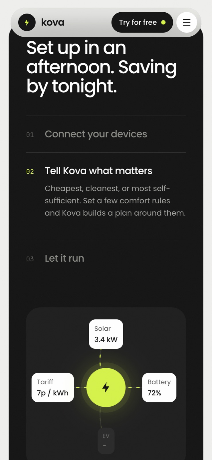
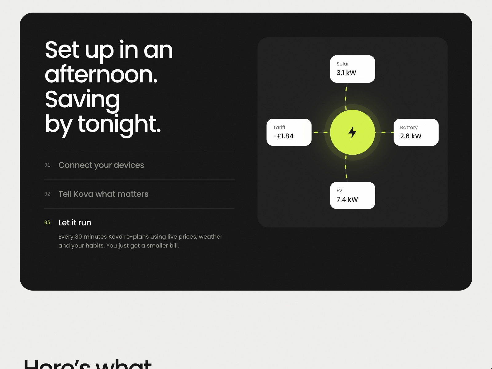
- An animated setup diagram with power flowing between the devices
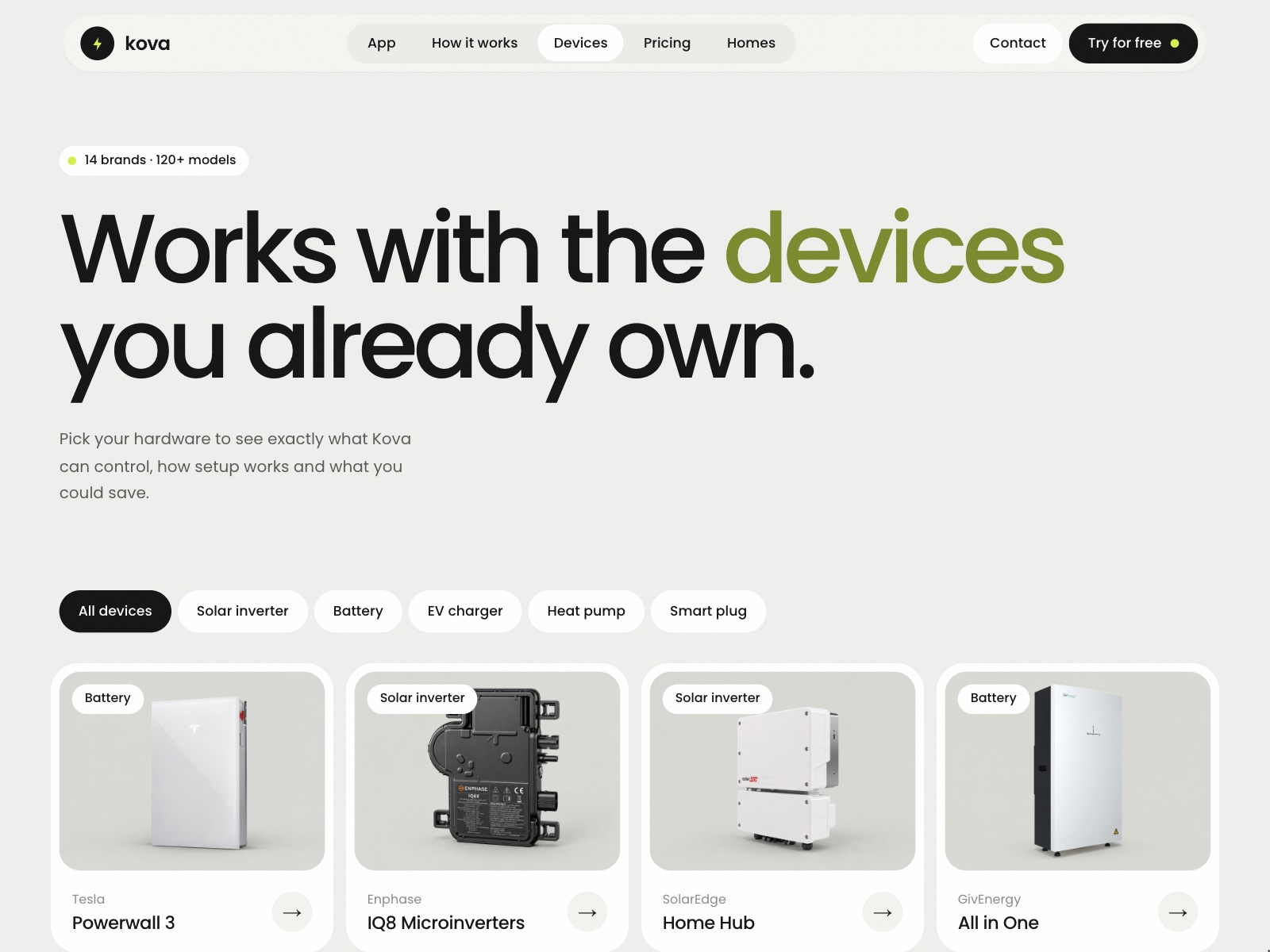
- Nine CMS collections, with filters, related devices and FAQs running on references
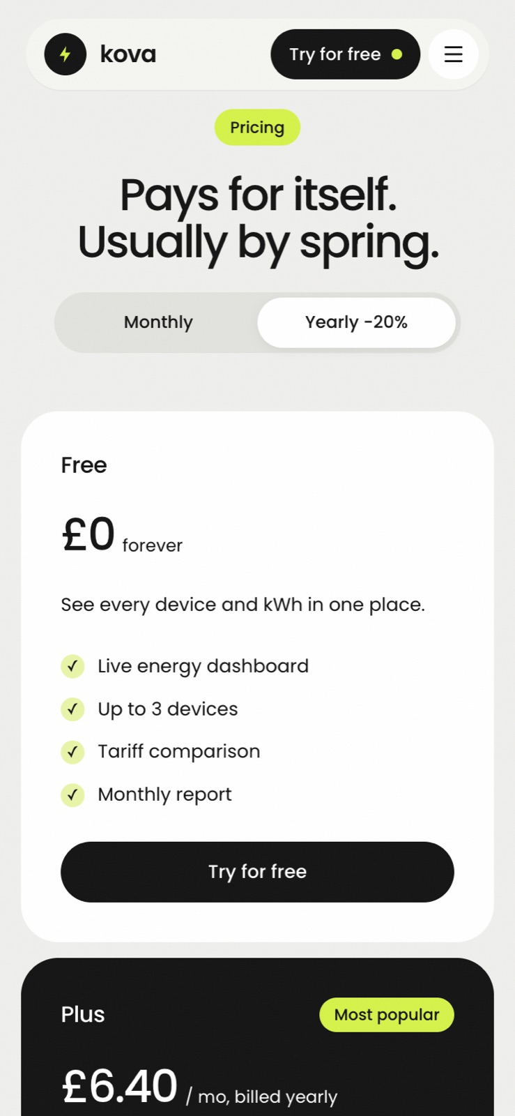
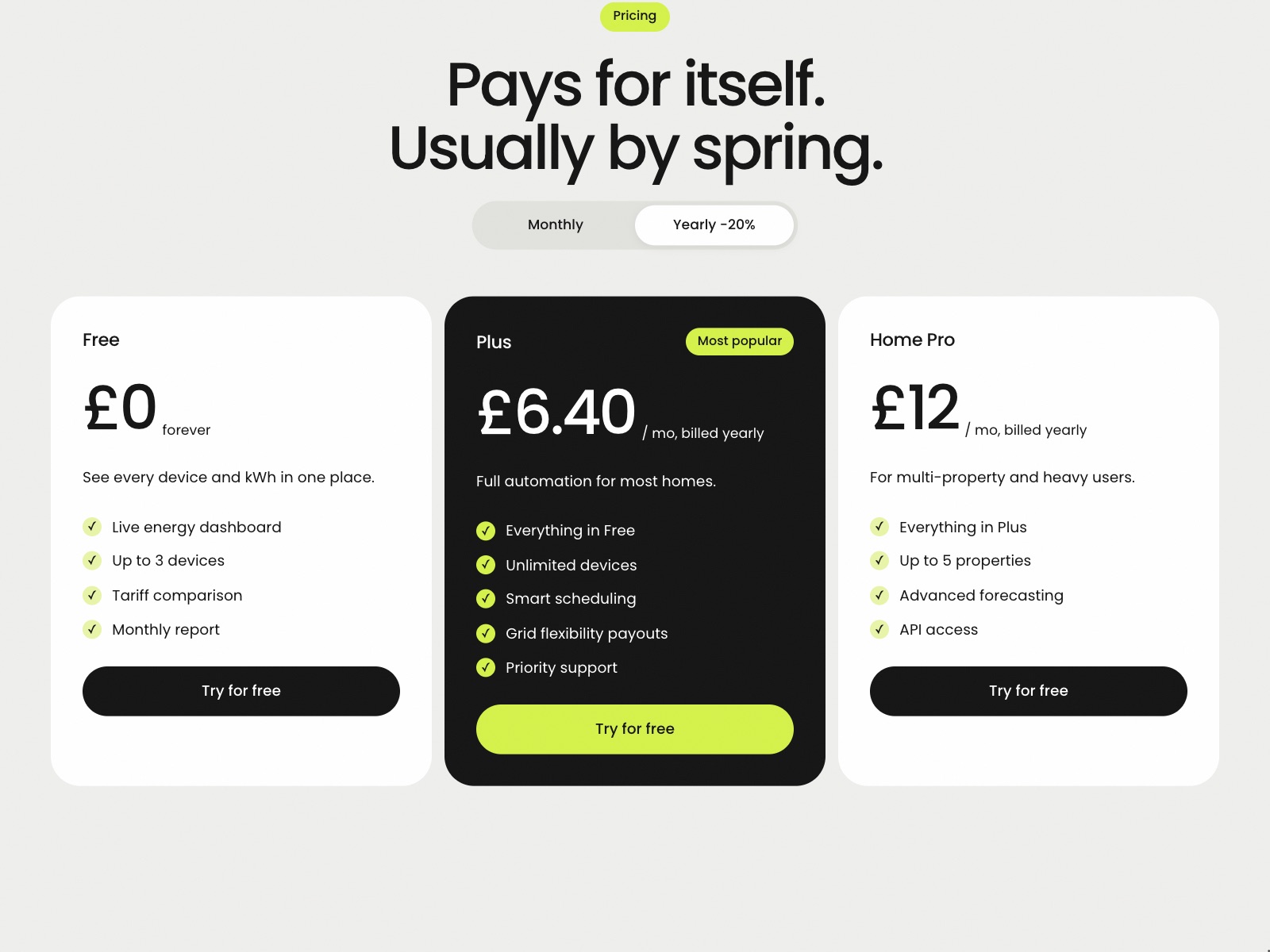
- A monthly and yearly pricing toggle, a plan comparison table and FAQ accordions
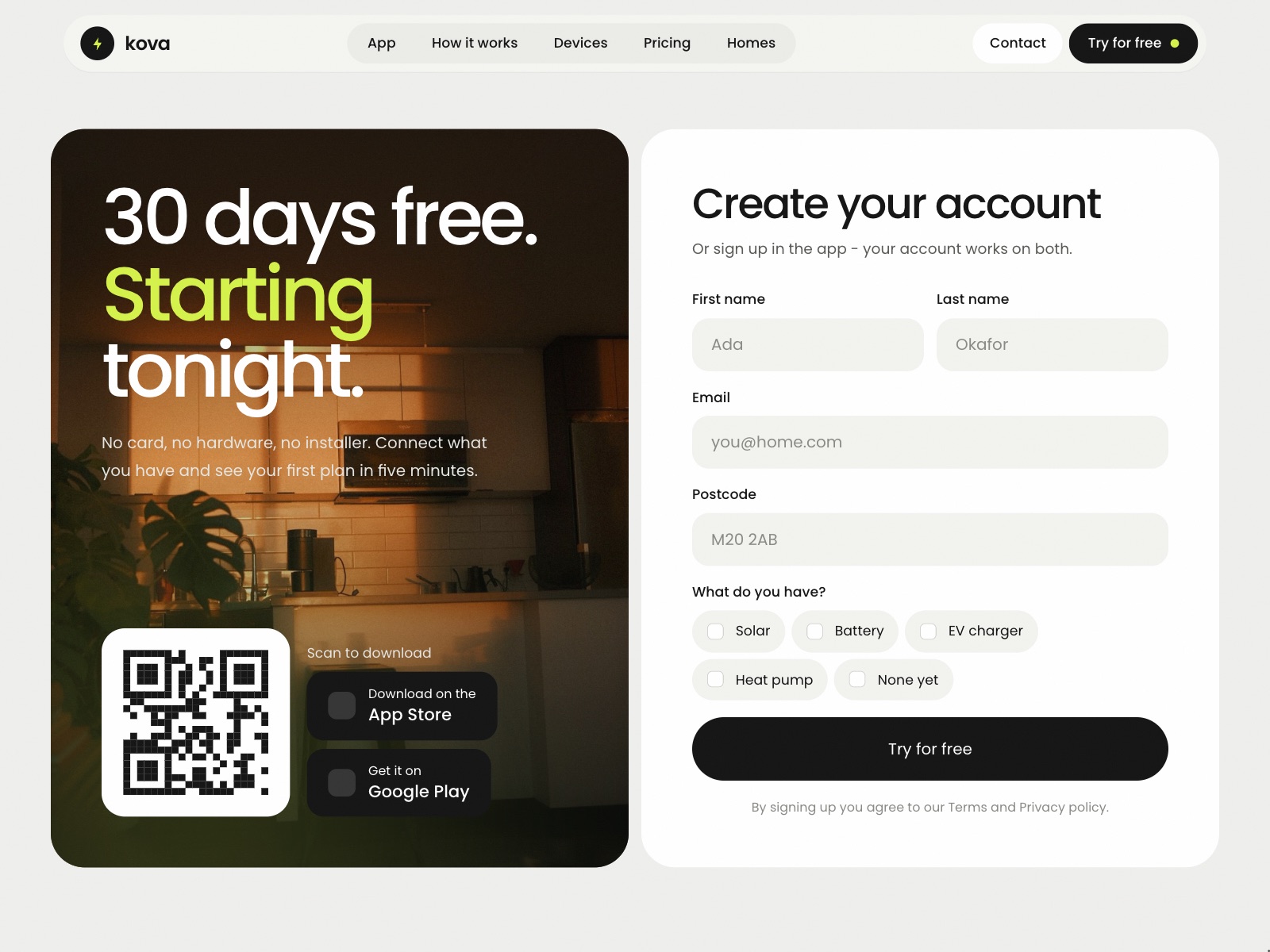
- Contact, sign-up and job application forms, and a nav that compacts on scroll
The hero shows the home running
Most energy sites open on a promise. Kova opens on the product working: a live readout under the headline, with tabs for three moments in a day. A sunny afternoon runs the home on solar, the evening peak shaves the grid with the battery, and overnight charges on the off-peak tariff.
Each tab changes the reading, the source and the bars - solar carrying the house, then the battery, then the grid - so a visitor understands what Kova does by watching it decide, before they read a word about it.



Proof, then the product, then the hardware
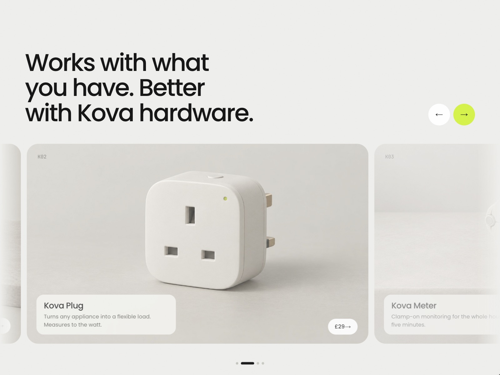
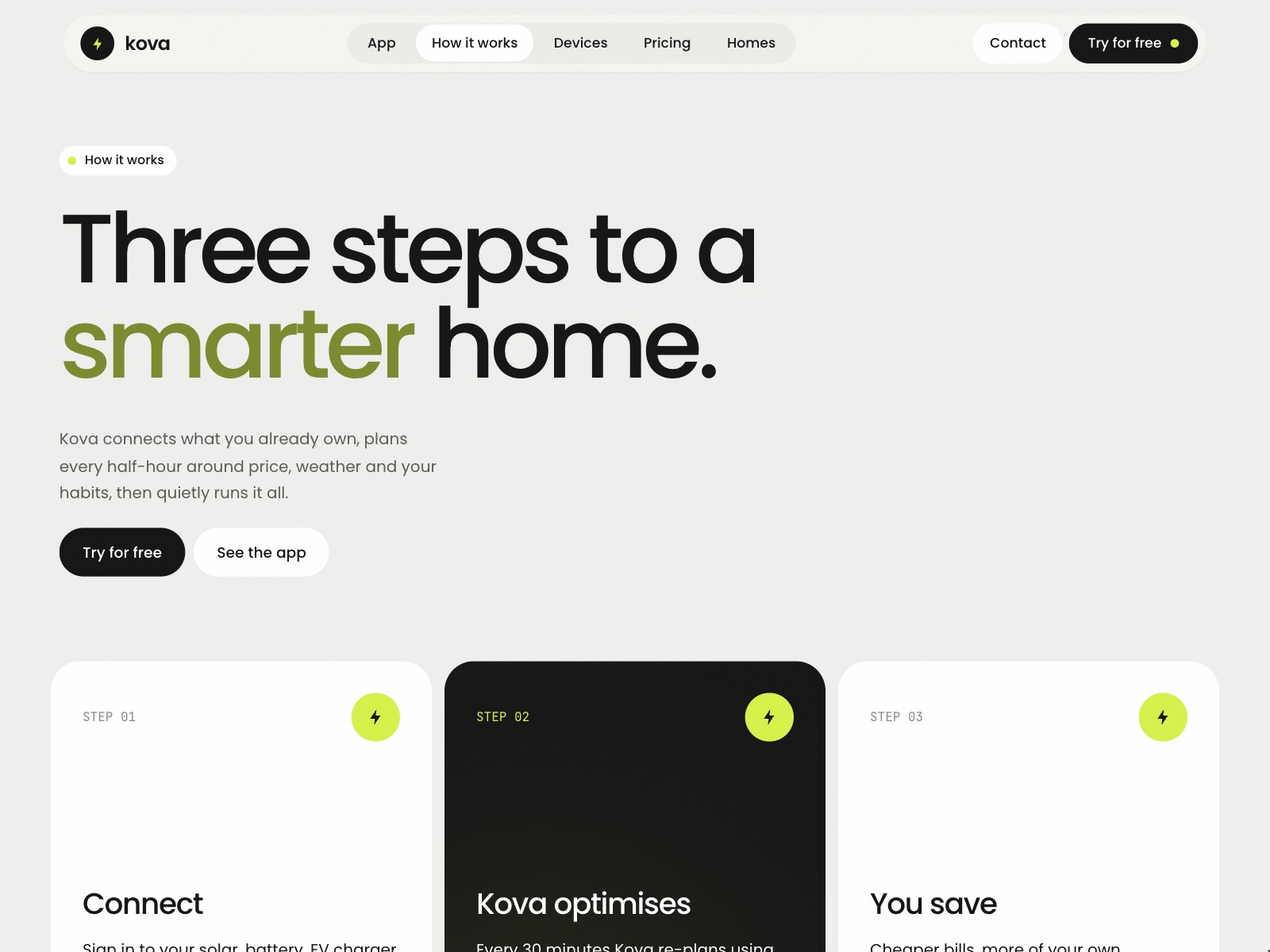
The home page is ordered the way trust is built. A bento of numbers and real homes first, then the setup in three steps as an animated diagram with power flowing between the devices, then the hardware itself in a carousel, and only then pricing, with a monthly and yearly toggle that shows the saving rather than stating it.
Twenty pages, run by nine collections
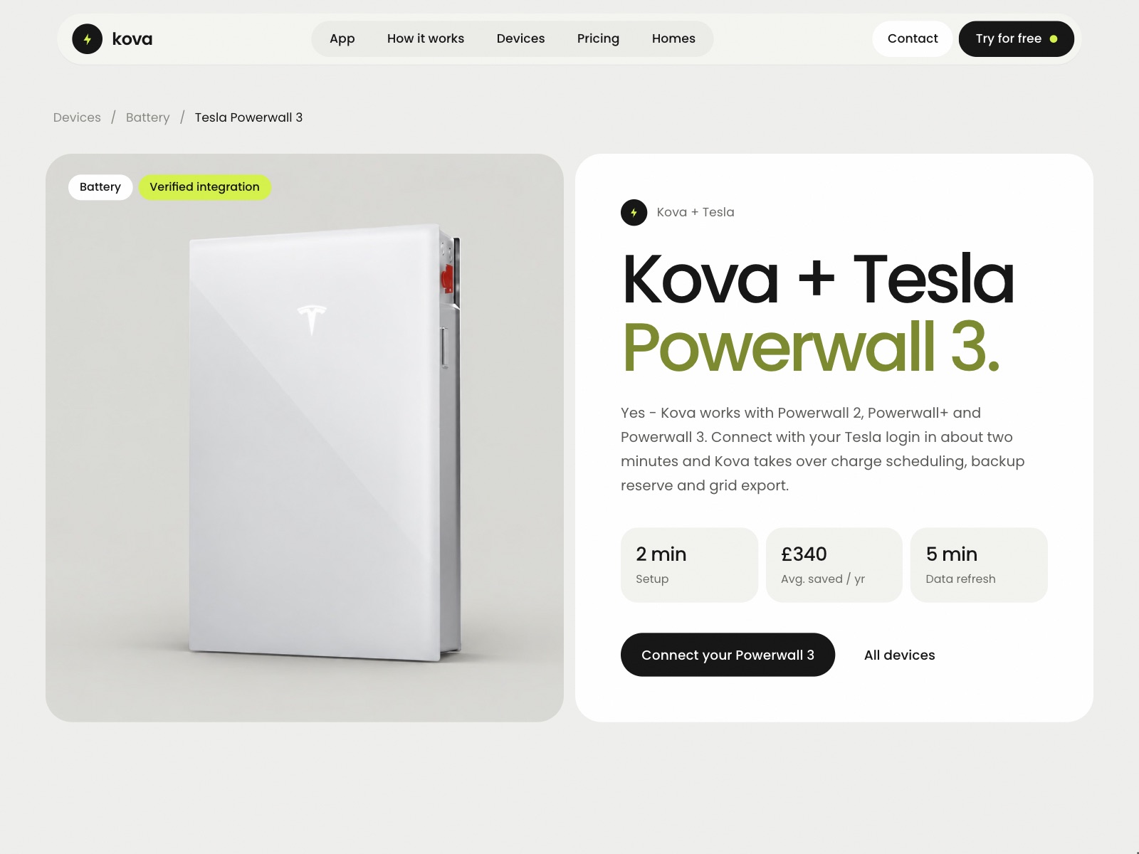
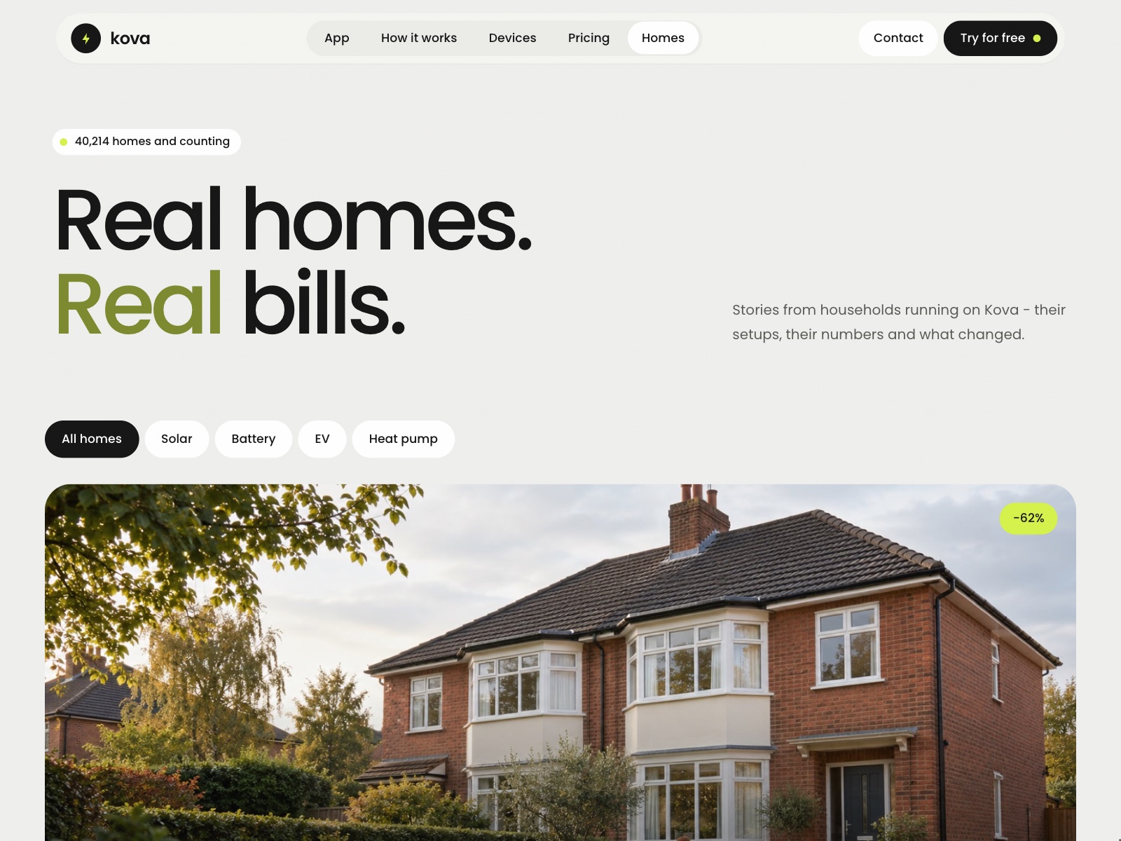
A template this size only works if the buyer can fill it without rebuilding it. Devices, homes, journal posts, help articles, jobs, the team, testimonials and FAQs are all CMS collections, tied together by a shared set of tags.
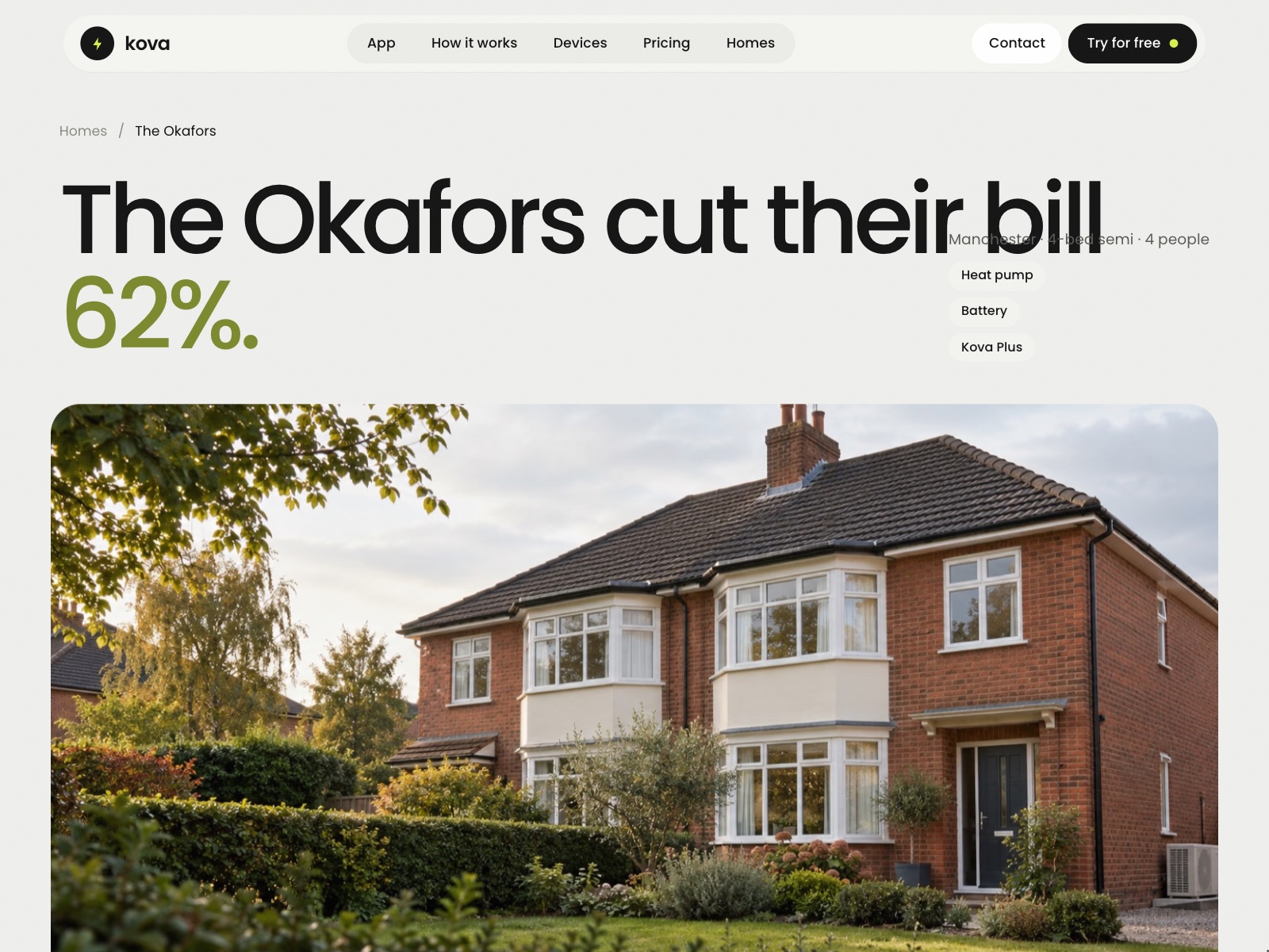
So a device page pulls in its own FAQs and the devices that work with it, the homes list filters by setup, and adding a new home story is filling in a form rather than designing a page.
The whole company, not just a landing page
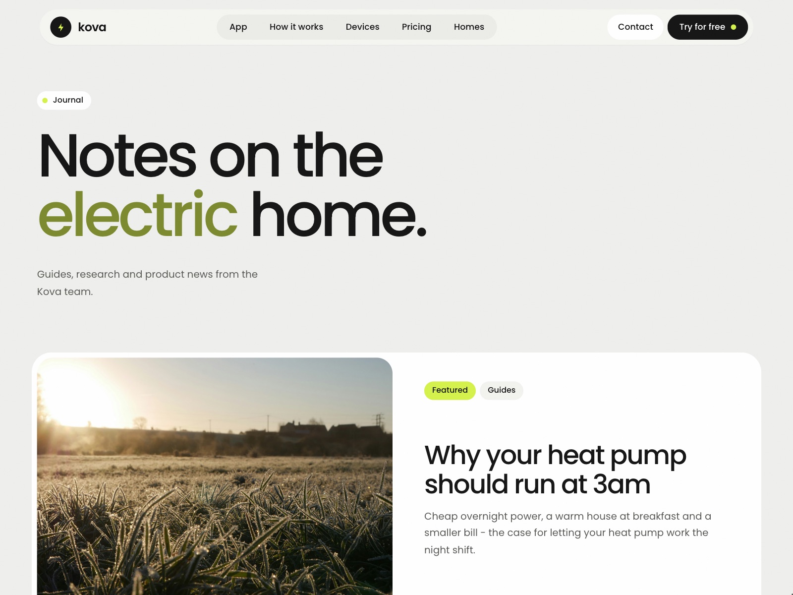
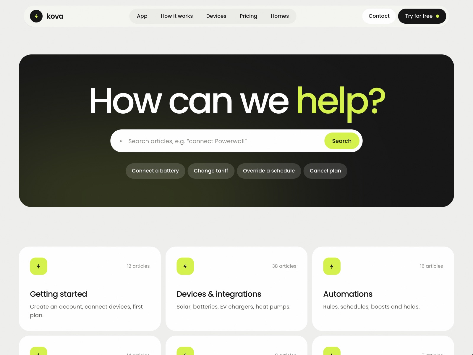
Most templates stop at the home page. Kova includes the pages a real company needs once it has customers: how the app works, a journal, a help centre, an about page, careers with open roles and an application form, and a sign-up page for the app itself.
Built natively, so it stays editable
I built Kova from my own designs, measuring each page at desktop, tablet and phone widths and rebuilding it in Framer to match. Every animation, switcher and form state is a native Framer component, with no custom code and no overrides, so the person who buys it can change anything on the canvas. At phone width the nav becomes a menu and every section reflows into one column; the recording runs from the preloader to the footer.