Santechture
Making fifteen years of revenue cycle expertise legible in four products
Santechture is revenue cycle management for healthcare across the Gulf - AI that reviews, validates and acts on a medical claim before a rejection costs a hospital money. Four products, and by its own account $8.5bn of claim value processed since 2019. The buyer is a hospital CFO, not a consumer.
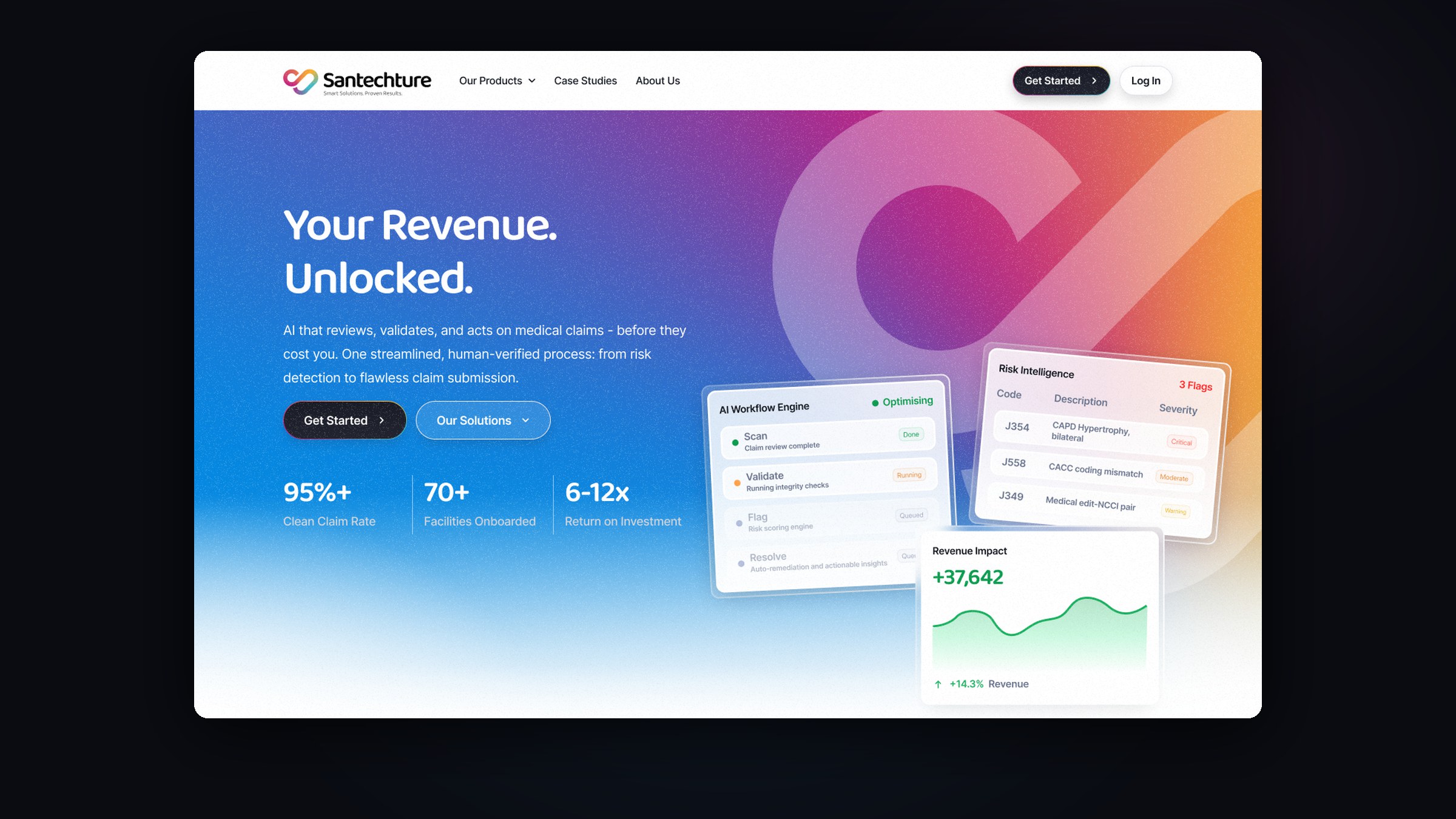
Revenue cycle management is an unglamorous category that sells on trust: the decision is financial, the buyer is technical, and nobody chooses a claims platform because the website was pretty. So the site leads with the outcome - “Your Revenue. Unlocked.” - and puts the proof directly underneath it: clean claim rate, facilities onboarded, return on investment, before a single feature is named.
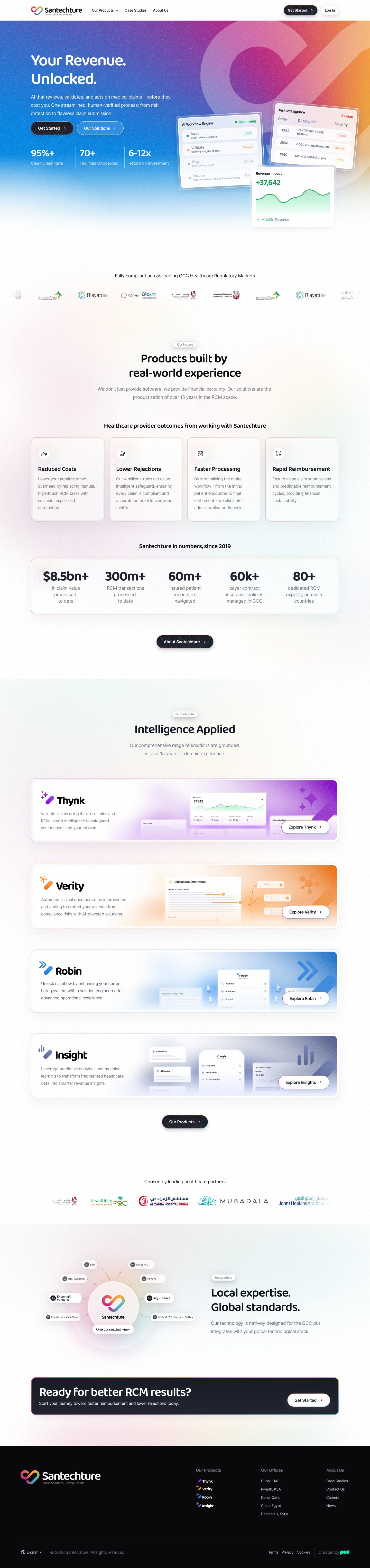
The harder problem was four products that overlap. Thynk, Verity, Robin and Insight all touch the same claim, and a buyer who cannot tell them apart buys none of them. Each gets its own colour, its own page and its own argument, while the homepage holds them together as one system.
- The marketing site end to end - positioning, structure and interface
- A visual system that gives four products distinct identities inside one brand
- Product pages built to be read by a CFO and a clinician alike
- Interface vignettes that show the software working, rather than screenshots of it
- A white-paper template, and the lead capture the whole site funnels into
- Arabic alongside English, for a business that sells across five countries
The outcome first, the proof second, the products third
The homepage is ordered the way the sale actually happens. A promise a CFO recognises, then the three figures that make it credible, then what the software does, and only then the four things you can buy.
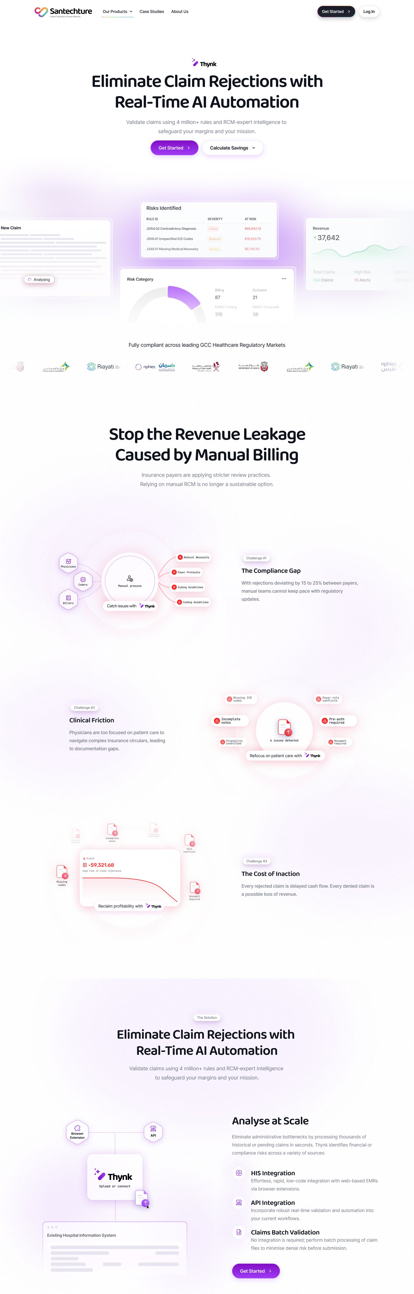
The product cards are the hinge. Each carries its own colour and a vignette of the interface doing its job - a risk table flagging codes, a workflow engine mid-run - because “AI-powered claims validation” means nothing until you have seen what it looks like on screen.
Four products that had to stop sounding alike
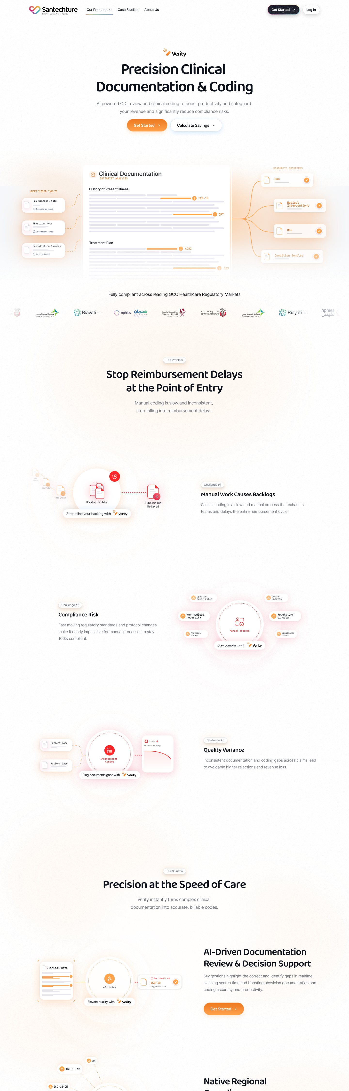
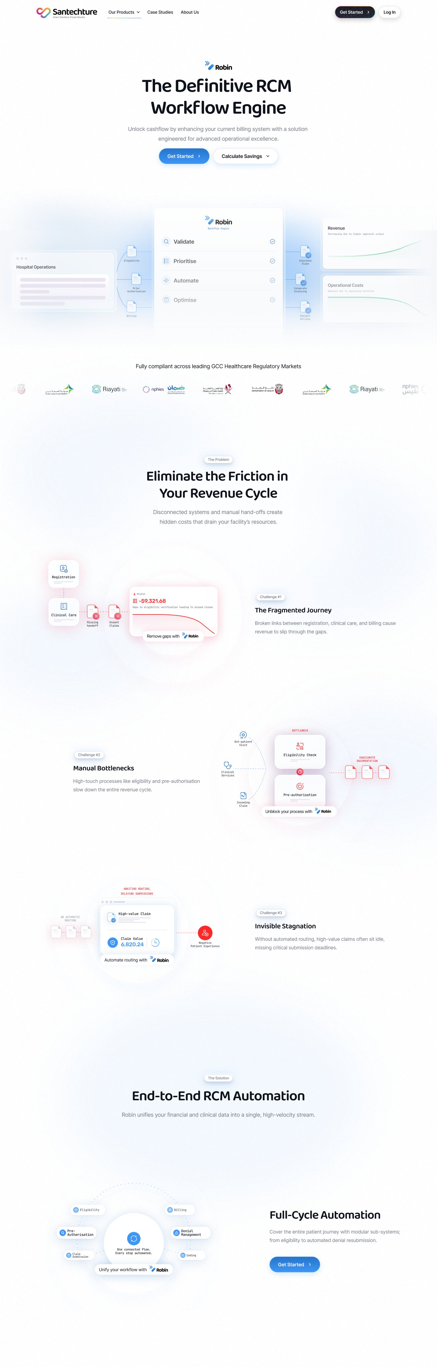
Thynk validates claims, Verity improves clinical documentation, Robin runs the billing workflow. On paper they blur. Each page therefore opens on the problem in its own words - eliminate claim rejections, protect revenue from compliance risk, unlock cashflow - and holds a single hue the whole way down.
They share a spine underneath: the cost of doing nothing, the mechanism, the evidence, who it is for, what it costs. A buyer comparing two of them is comparing like with like rather than re-learning a page.
The pages that do the rest of the selling
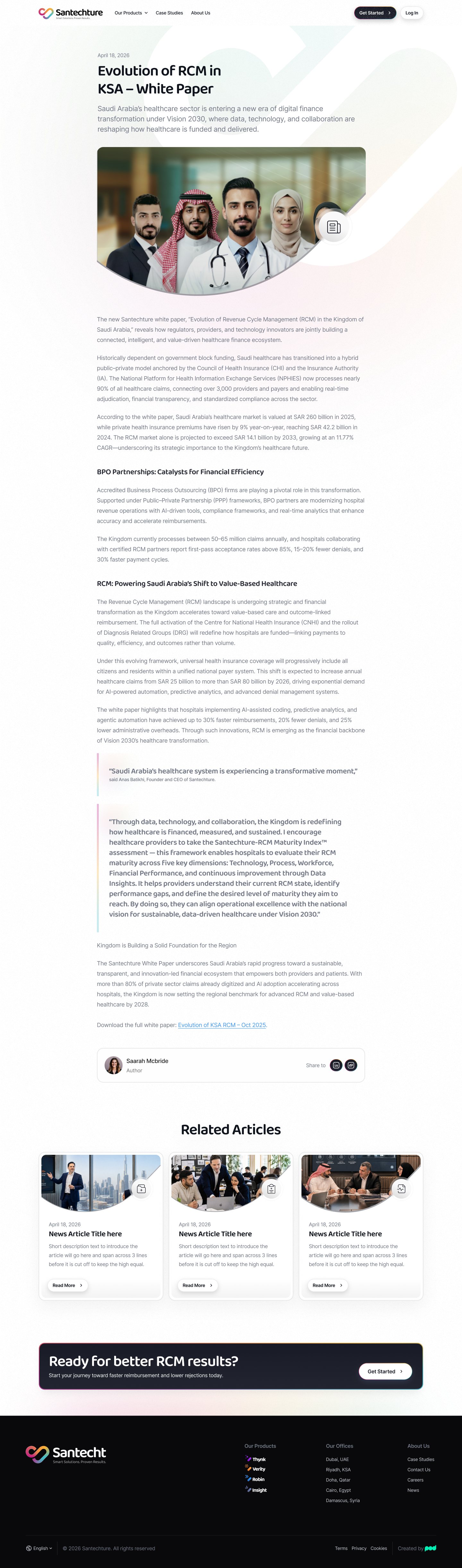
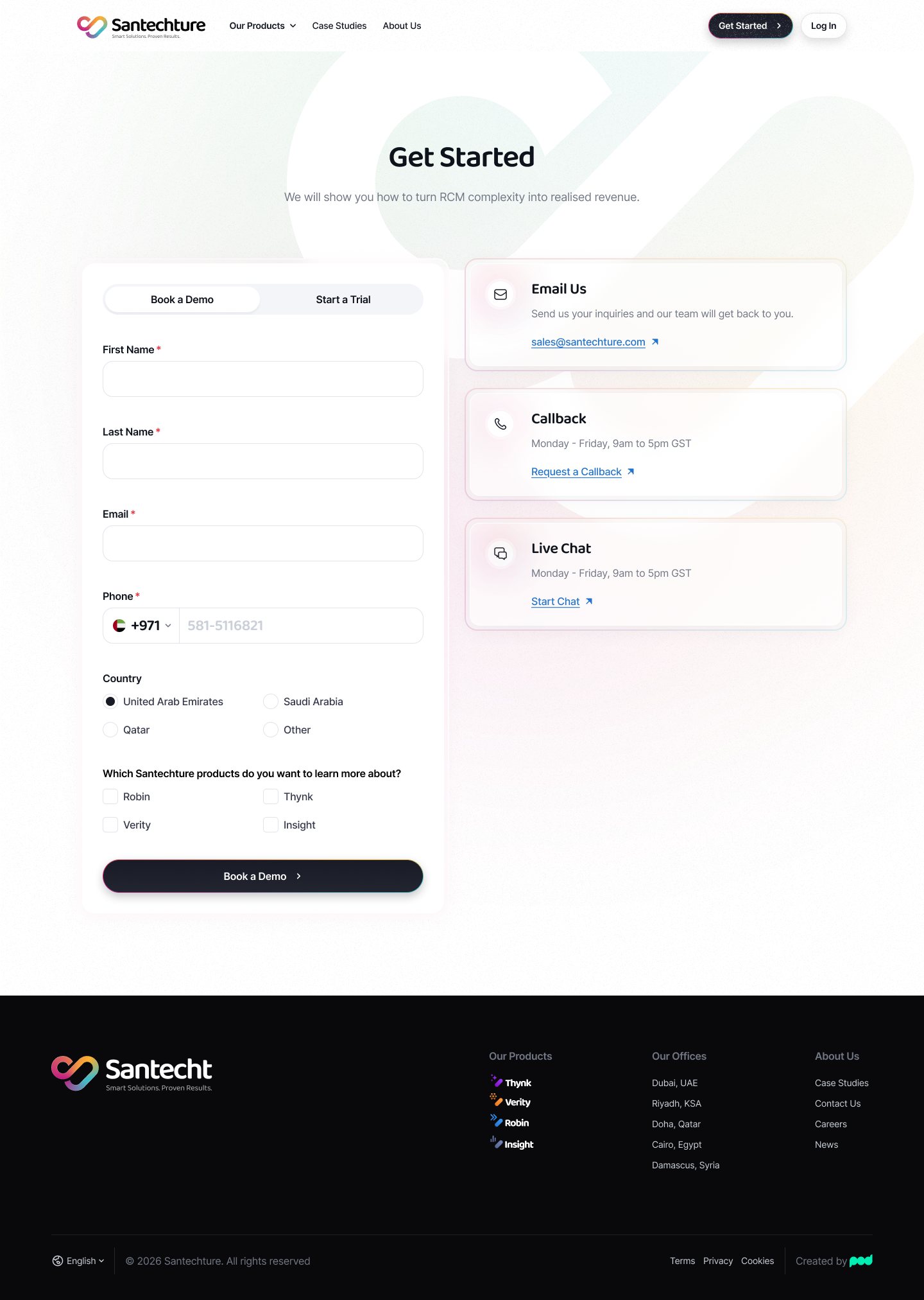
A category this technical is won in long form. The white-paper template is built for a document somebody actually reads - a measure that holds a line of body copy, pull quotes that carry the argument, related reading at the end. And every path on the site lands in the same place: one capture page that asks which of the four products you came for, and offers a callback or a live chat to anyone not ready to fill in a form.